
In many of my writings about color correction, both here on ProLost and in The Guide, I’ve talked about the balance between an aggressive “look” that helps tell your story through the use of a pervasive palette, tone, style, and feel; and the preservation of appealing skin tones. When grading a scene, you can push your look much further if you don’t lose track of appealing skin tones. Or, if you so desire, you can make a strong visual statement by choosing to allow your skin tones to get subsumed by your look.
The truth is, skin tones are just one of a small handful of what I call “memory colors.” Memory colors are colors that are, in the minds of your audience, inseparable from certain common objects or events. For example, the sky is so associated with blue that you might feel that you see those two words together as often as you see them individually. The same goes for green and grass.
The most basic idea of color correcting is that you are making colors correct, which is to say that you are making objects on the screen appear to be the colors that we know them to be.
The funny thing about this seemingly simple task is that it can be quite difficult. And it’s difficult for exactly the reason that it’s important.
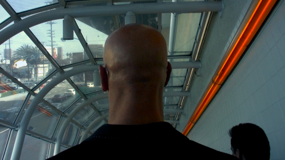
The human brain is so tied in to our eyesight that we internally auto-correct for certain colors. This is the very definition of a memory color. For example, if you grew up in the United States, you know that a stop sign is red—so you tend to see an image of one as being red even if the color is way out of whack. In the shot below, we recognize the bald head as that of a Caucasian male, even though the white balance is incorrect.

We see his head as skin-colored, even though empirically it is actually almost perfectly gray! You might not believe me, so here’s a crop of the back of his neck to prove it:

This a variation of a common optical illusion called the Same Color Illusion. We “know” that square A and B are different shades of gray “in real life,” and that knowledge prevents us from seeing that they are in fact the exact same shade in the image (click the image to see proof).

UPDATE: Aaron points out below that the Color Constancy Illusion may be a better model of the problem.
Back to the head. Even though they “know” what color it is, your audience will respond more favorably to a memory color object if their knowledge of it matches their experience, rather than fights it. And so it falls to the colorist to correct the color of the head, to make it head-colored rather than gray.
In 2008 I pointed out an example of this from the trailer for The Incredible Hulk (Steve Bowen, colorist). Edward Norton’s face appears the same color whether in a cool scene or a warm scene.

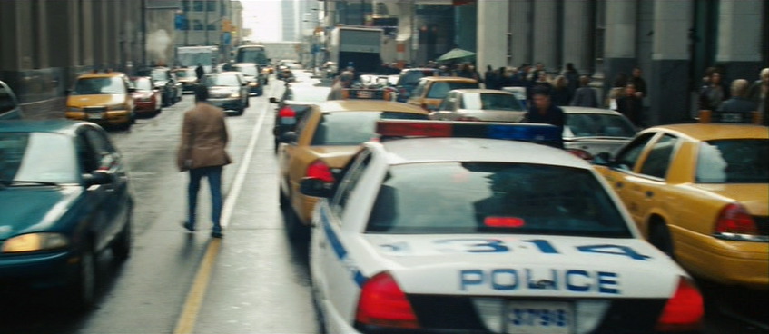
Preserving skin tones is important, but so is preserving other memory colors. Here’s a shot from Jumper (Steven J. Scott, colorist). Sam Jackson is about to walk through a crowd of people. His and their skin tones are accurate, even though their world is a faded, monochrome olive drab.

But back up a few seconds in the same shot and notice that in this faded world, brake lights are perfect, vivid red, and New York taxis read as the correct yellow-orange. This is an establishing shot, and if the grade abused the hue of the taxis too harshly, we might not read “New York” as readily.
Here’s a very short list of memory colors I try to keep in mind when coloring:
People are pink/orange (a color I like to call porange)
Grass and summer trees are green
Water and skies are blue
Fire engines, stop signs, and blood are red
You could also add just about any food to that list. Unless you’re deliberately trying to make something look unappetizing, it’s probably good to render food as accurately as possible—as I’ll show you in a moment.
I welcome your suggestions of other memory colors. And bear in mind that memory colors might vary from film to film and even scene to scene. In Stomp the Yard, there’s a scene at the beginning where almost nothing is red. Later, there’s a red jacket color so important to the story that it leaps out of every scene in which it appears.
So what’s the big deal? Objects have colors, and the colorist makes sure those things stay those colors. Easy, right?
Not necessarily. To achieve the look of that Jumper shot—where key colors pop but unimportant ones blend into a complimentary shade of blue-green—requires practice, skill, and taste. It’s hard enough under the best of circumstances, but lighting, atmosphere, bounce light, flare, camera settings, and a hundred other factors can conspire to force objects to render on-screen in colors quite unlike their real-world hues.
The good colorist first picks the memory colors important to the scene, and then ensures that they stay consistent, often combating these factors to do so.
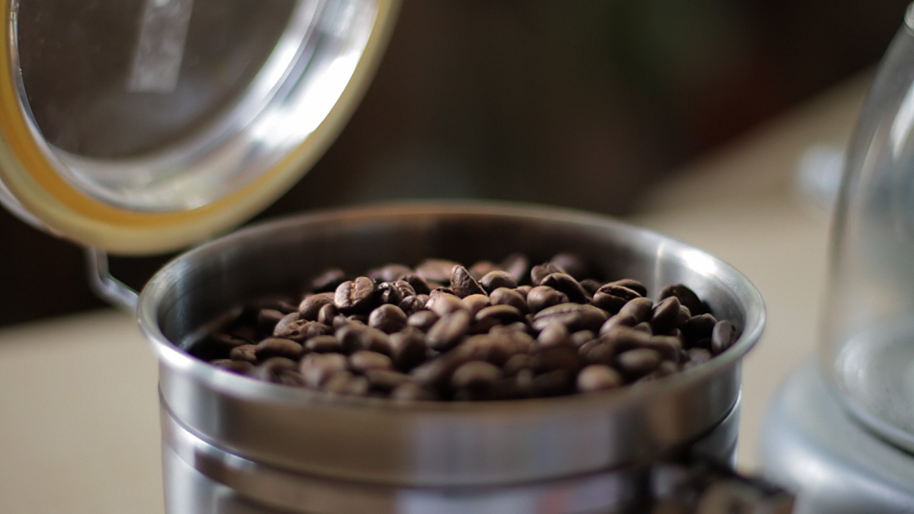
Here’s a very simple example. I bought some espresso beans today from my favorite local roaster, Blue Bottle coffee. As I was transferring them to an air-tight container, my 7D was right there, so I popped off a quick 720p60 shot of the process—because who doesn’t like seeing coffee beans tumble in slow motion?

When looking at the footage on my computer, I noticed a funny thing. The beans, which in life have a vivid, sumptuous brown tone, appeared gray-black on my screen. I almost didn’t notice, because I know they are brown, but on close inspection it was clear that I had been fooled by my brain into seeing what I knew rather than what was actually there. The cool color temperature of the indirect sun lighting the shot was reflecting off the beans and cooling their color down to near neutral.
There’s nothing unnatural or wrong about this, except that the audience for my espresso epic doesn’t know about the cool light source outside of the frame. They don’t even necessarily know what the falling objects are. I have to communicate that visually, so I need to preserve—or, in this case, recreate—the memory color of perfectly roasted coffee beans.
Here’s the shot with a Colorista Power Mask for just the beans:
And here’s that same shot with an overall look applied after the bean color fix.

To really see the importance of the local correction, look at the shot with the look, but without the bean fix:

Not only do the beans look more appetizing with the fix, they also survive the subsequent look adjustment better. In fact, since the look cools down the shot a bit, the warm color of the beans stands out all the more. Without the bean fix, the look utterly clobbers the brown beans. As a bonus, in the corrected version, the metal canister and the corner of the grinder on the right take on a steely blue color, better matching the viewer’s idea of what color metal should be.
If you pick your memory colors for a scene, and preserve and enhance them through your look, you’ll wind up with shots that pop without looking clobbered by a heavy-handed “preset” look.
Want to learn more? Check out some great books on color correction at the ProLost Store, or find more ProLost posts tagged with Color.
Update
on 2010-02-22 23:46 by Stu
Folks following me on Twitter know that I’ve been posting the occasional color correction before/after example there. I’ve now collected them here, including a higher-res version of the coffee bean example.