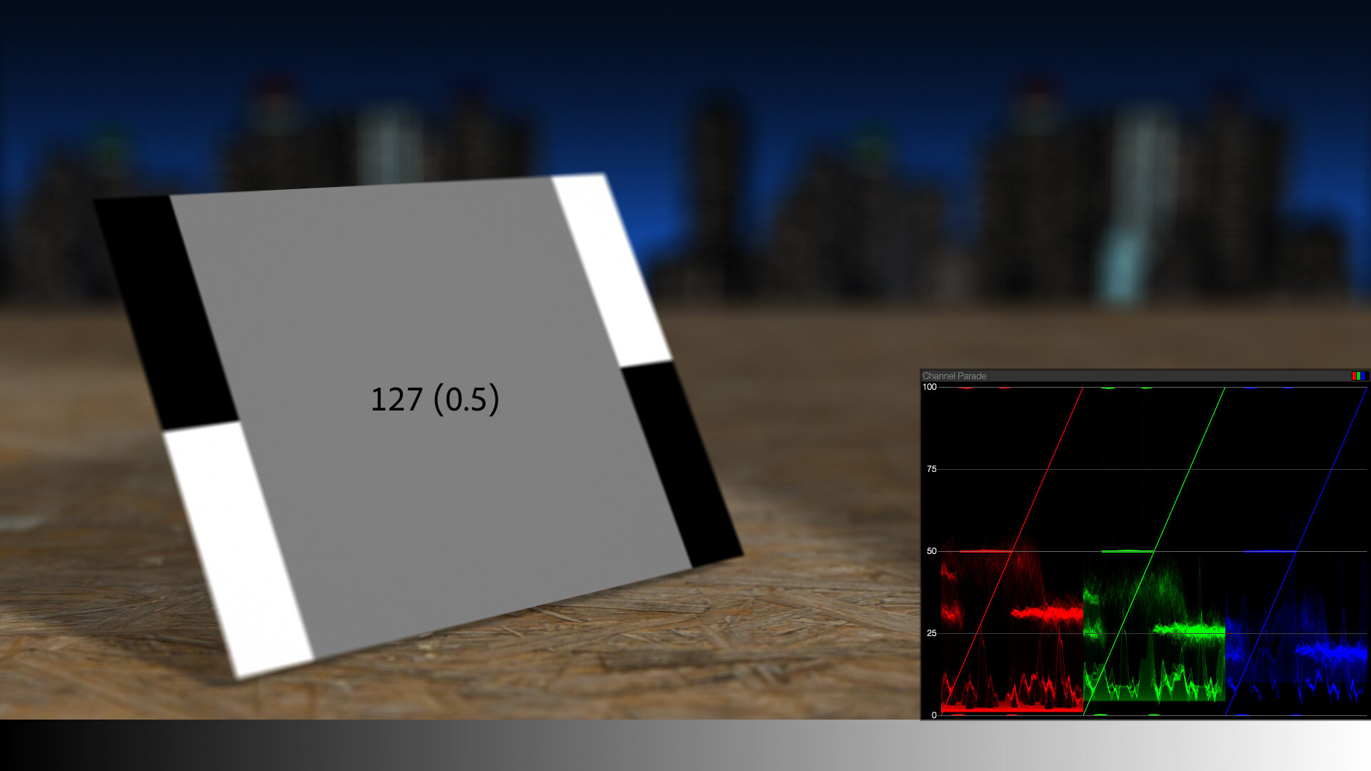
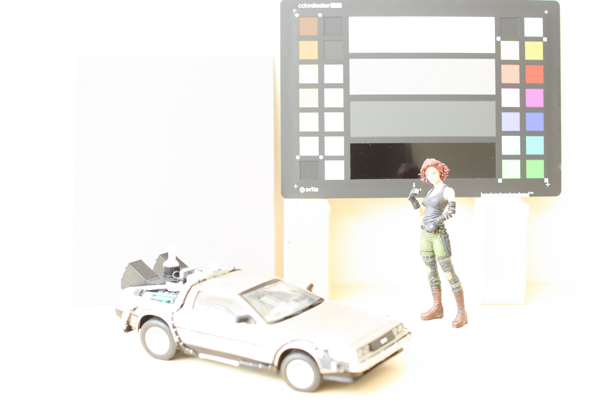
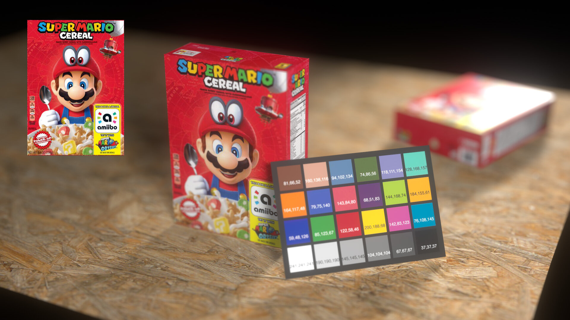
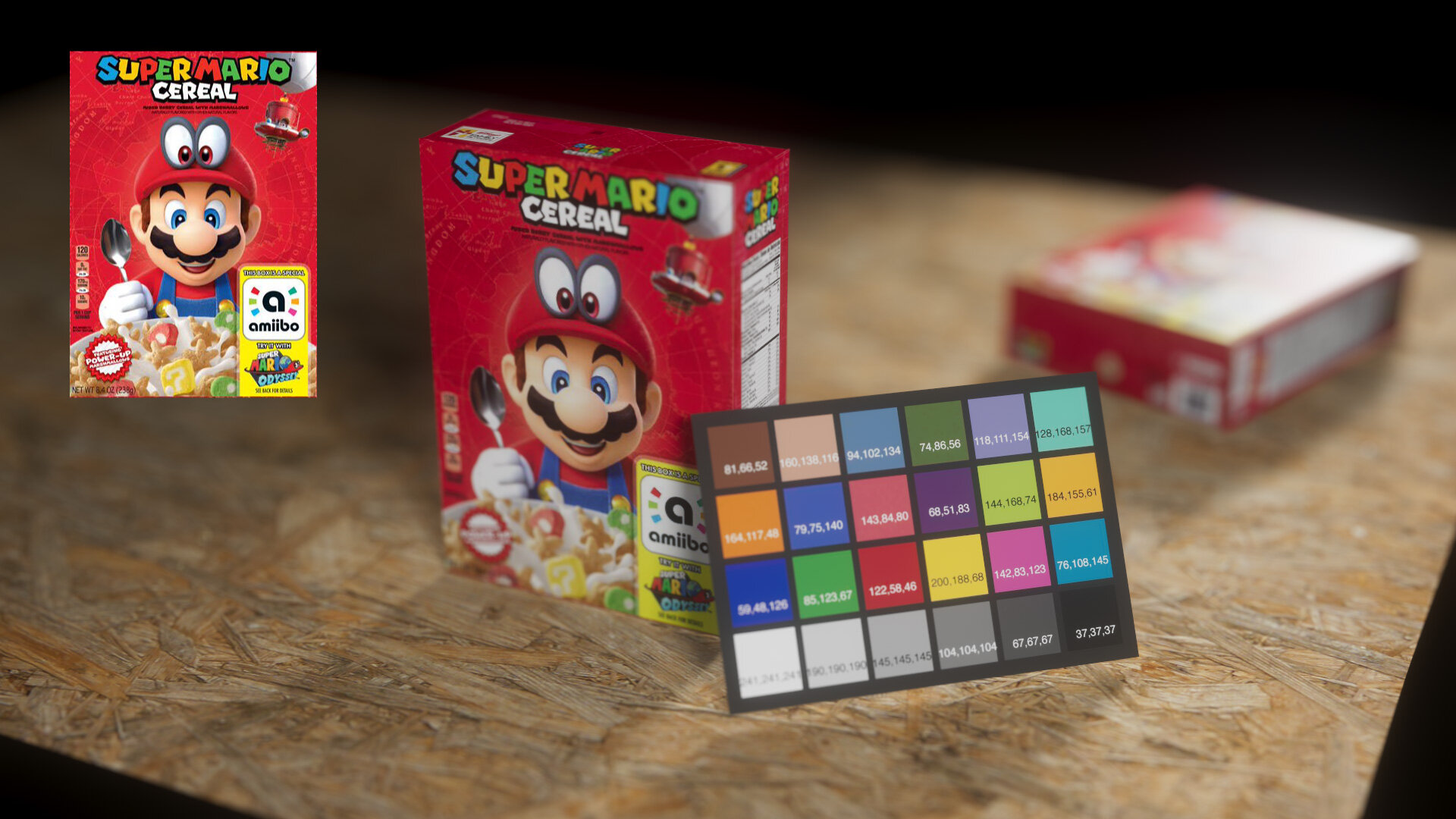
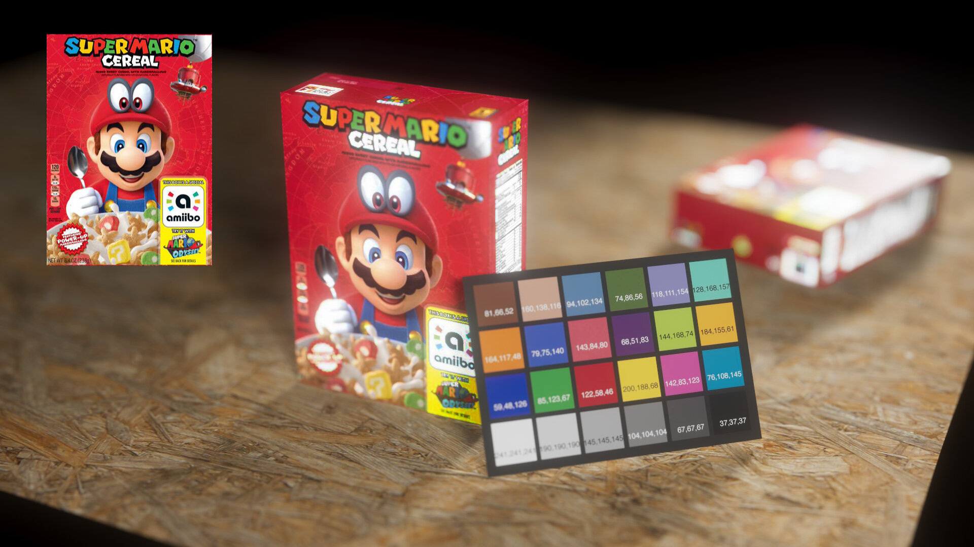
Imagine a digital 50% gray card. In 0–255 RGB values, it’s 127, 127, 127.

On the RGB parade scope, the card is a perfect plateau at 50%.
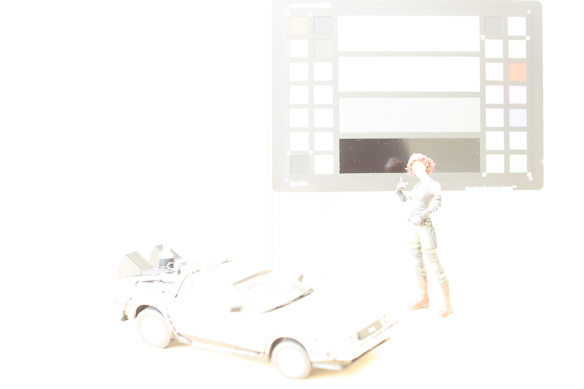
Now imagine increasing the exposure of this scene by one stop. “Stops” of light are an exponential scale, meaning that subtracting one stop is cutting the quantity of light in half, and plus one stop is twice as much light. The light in our image is expressed in RGB pixel values, so let’s double the simulated light in this scene by doubling the values of the pixels.
Predictably, the 50% region has doubled to 100%. The perfectly-white regions are now overexposed to 200%, which looks the same as 100% in this non-HDR view. Our idealized pure-black patches remain unchanged.
But anyone who has moved a camera out of Auto mode knows that overexposing by one stop does not slam middle-gray into pure white. And anyone who has shopped for physical camera charts knows that you don’t buy “50% gray” cards. A middle-gray card at a camera store is an 18% gray card. So what’s up?
Yes, We’re Back to This Again
Back in 2009 (yikes) I tried to draw to a close my long history of writing about linear light and how it affects 3D rendering and compositing. But a funny thing has happened since then — along with many formerly niche Prolost subjects such as large sensors, 24 fps, and cinematic color, the topic of color management has become, and I can’t believe I’m writing this, popular?
That is thanks largely to ACES (Academy Color Encoding System), a color system aspiring to become the industry standard for managing for motion picture and television production. ACES builds on the ideas of performing certain kinds of creative work in a realistic model of light, and adds an output rendering that is so creatively friendly that a new generation of 3D artists have seized on it as a key part of generating realistic and/or pleasing imagery.
The other reason I’m back to this is that, in looking back at my numerous posts on color, gamma, and linear floating-point, they reflect a process of discovery, exploration, and advocacy — but they don’t coalesce into one convenient archive of information. Much of my unabashed championing of working in linear light was in the form of my tutorial series on eLin, which has long been taken down as eLin itself is now blessedly approaching a decade and a half of obsolescence.
This post is an attempt to consolidate, summarize, and modernize the Prolost take on film color management. Buckle up, it’s a long one.
Middle Management
An 18% gray card appears “middle gray” to our eyes because we humans do not perceive light linearly. Human vision has a “gamma” of sorts — a boosting curve that pumps up our perception of darkness and compresses highlights. I’ve heard this explained as a survival adaptation — it’s easier to see a predator or prey in the dark if we boost up the midtones on our monkey goggles.
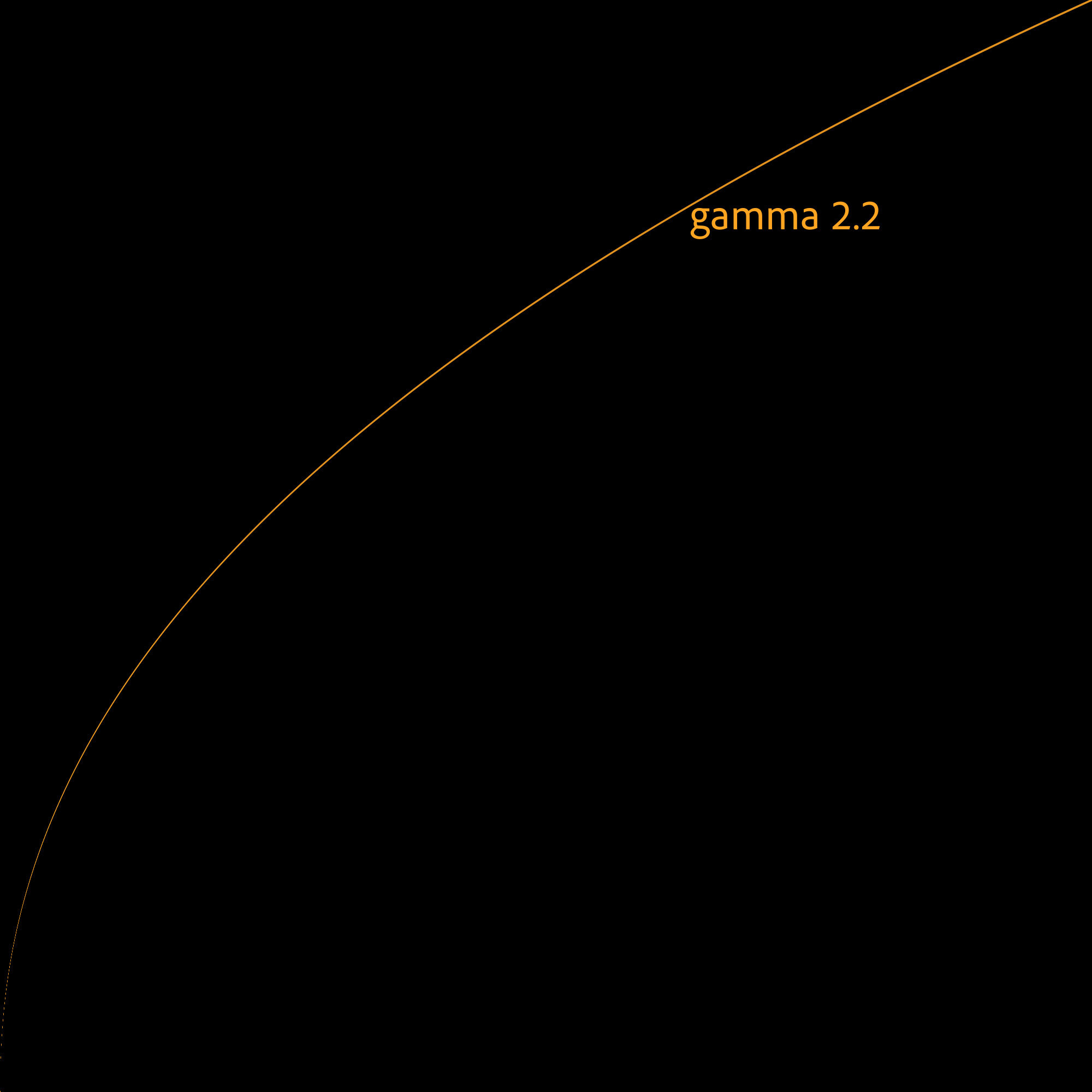
Raw light values without gamma (asterisk asterisk asterisk).
An approximation of the roughly 2.5 gamma of human eyesight.
It’s complicated, but the non-linearity of our vision closely matches a few historical imaging methods, such as the densities of dyes on a piece of film, and the voltages in a CRT. So by a combination of happy coincidence and clever design, images that “look right” to our eye on modern displays have a gamma that aligns with the way our brains transform light into pictures.
For the purposes of this discussion, you don’t need to deeply understand all that (exhibit A: your dear author). All I want you to take away from this section is: linear images, where pixel math aligns well with real-world light phenomena, don’t look “right.” An 18% gray card looks middle-gray both in-person and on on our devices because of a shared/complimentary nonlinearity. Our eyesight has a gamma, and so do the images.
Why do we Gamma?
This convenient alignment actually makes it counter-intuitive to imagine working with real-world light values. If a 50%-bright thing on the display looks 50% of the way between black and white to our eyes, where’s the problem?
The problem comes when we want to model the real-wold behavior of light. In VFX, we do this in 3D rendering of course, but also in compositing. That obviously-wrong one-stop-over-is-blown-completely-out gray card example at the top? We call that “working in display-referred space,” and it’s how a lot of computer graphics were created in the early days. It wasn’t right, and it often didn’t look right.
Light Wins
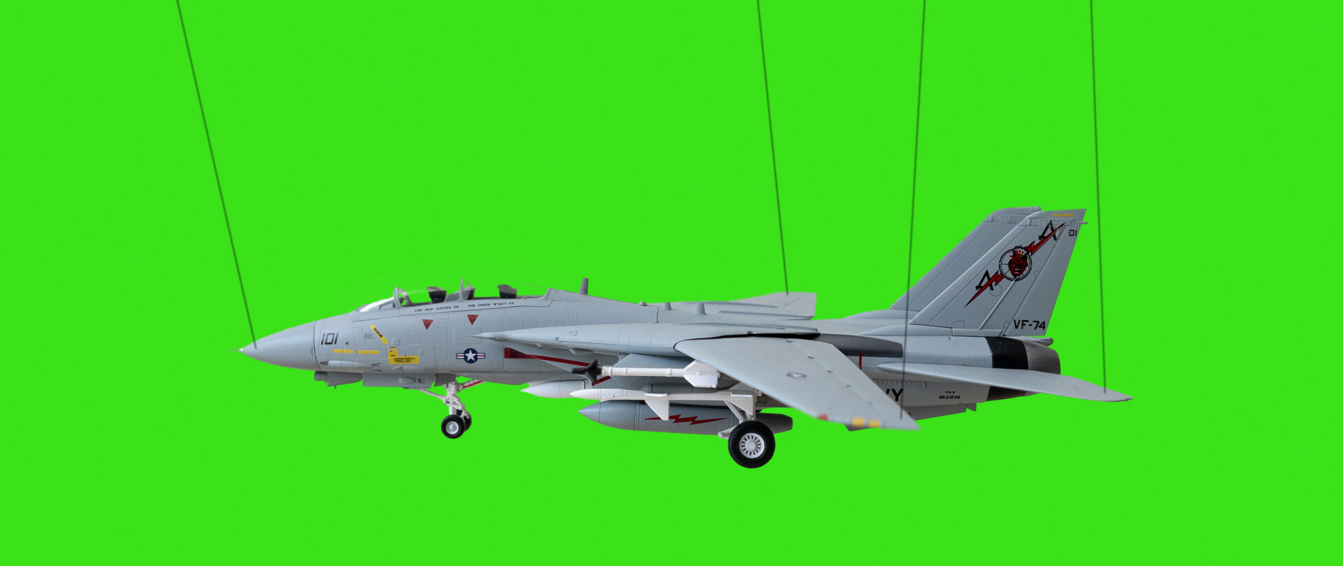
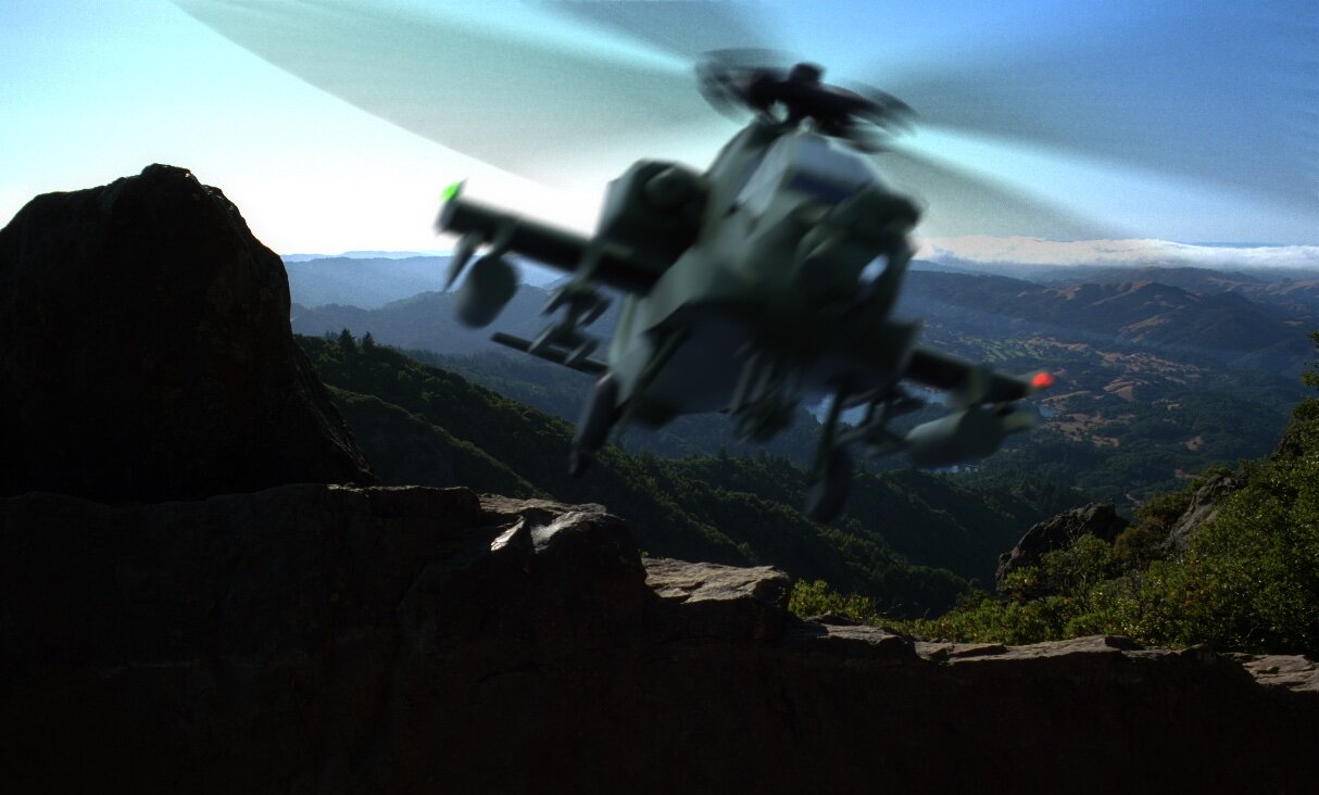
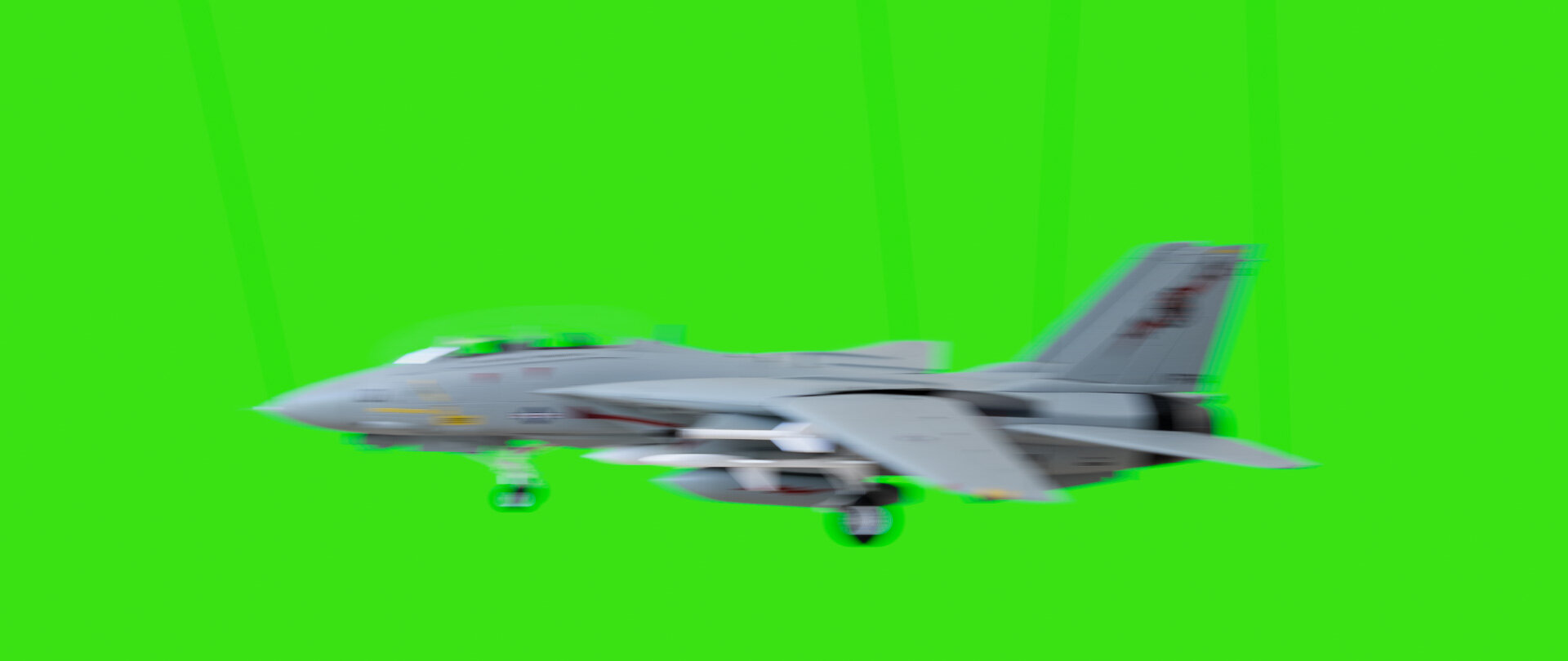
In the mid-nineties I was part of a commercial shoot so ambitious that the post house sent their technical wizard/color scientist to the set. We were shooting on 35mm film, of course, and had an elaborate post session planned that was, if you can believe it, to be handled largely using a video switcher, not anything digital. Our animation crew was preparing to dangle some props in front of a greenscreen, and we asked him what we should do for the strings. Use fishing line? Paint them green? We were not anticipating having the ability to digitally paint out the strings (the Flame was just in beta back then!), so our decision here mattered a lot. He suggested matte-black thread. “With the smallest amount of motion, the strings will disappear against the exposure of the greenscreen.”
I and my fellow art school graduates nodded in agreement, but were secretly dubious. Surely black would be highly visible against bright green?
We shook off our skepticism and took his advice, and of course he was right. But I didn’t quite understand why. In my mind, a black string would stand out against a green background — and even if it was motion blurred, it would still be a very visible black blur.
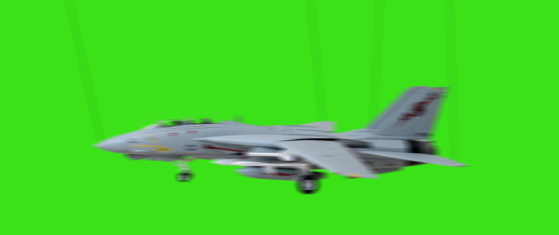
The simulated blur above is what I thought the film would record, because I thought light and dark things were all equally-weighted in the motion-blur soup. I was thinking that light mixed in units that matched my perception.
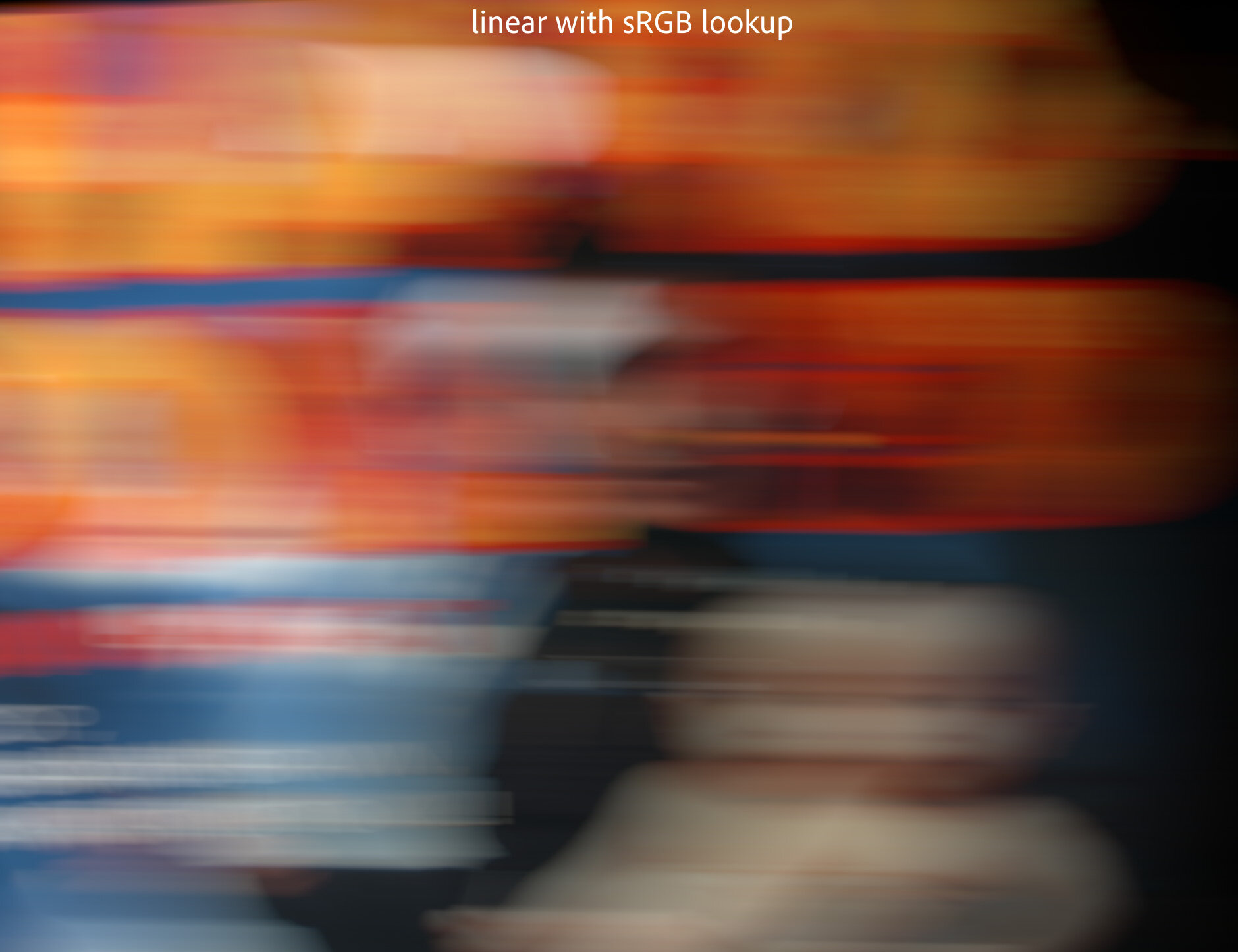
But the linear-quality of light means that bright things occupy more of the number-space of the simple math we use to blur and layer digital images. So light “wins.” Here’s the same simulated model shot with simple sRGB gamma management:

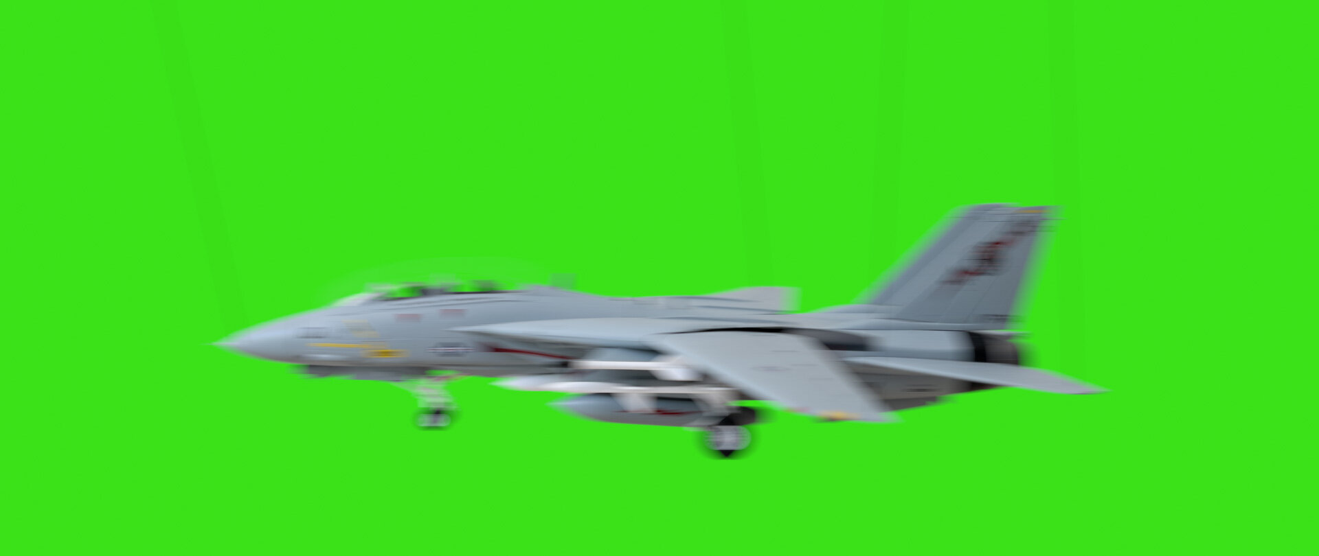

In this example, the jet, the strings, and the background are converted from video gamma to linear using an sRGB curve, making them appear darker. Then the blur is performed. An inverse sRGB curve is applied to the result, brightening it back up. The pixels that aren’t mixed or blurred look identical (they “round trip,” as we say), but the blurred areas of the image now reflect the real-world phenomenon of light’s predominance over dark.
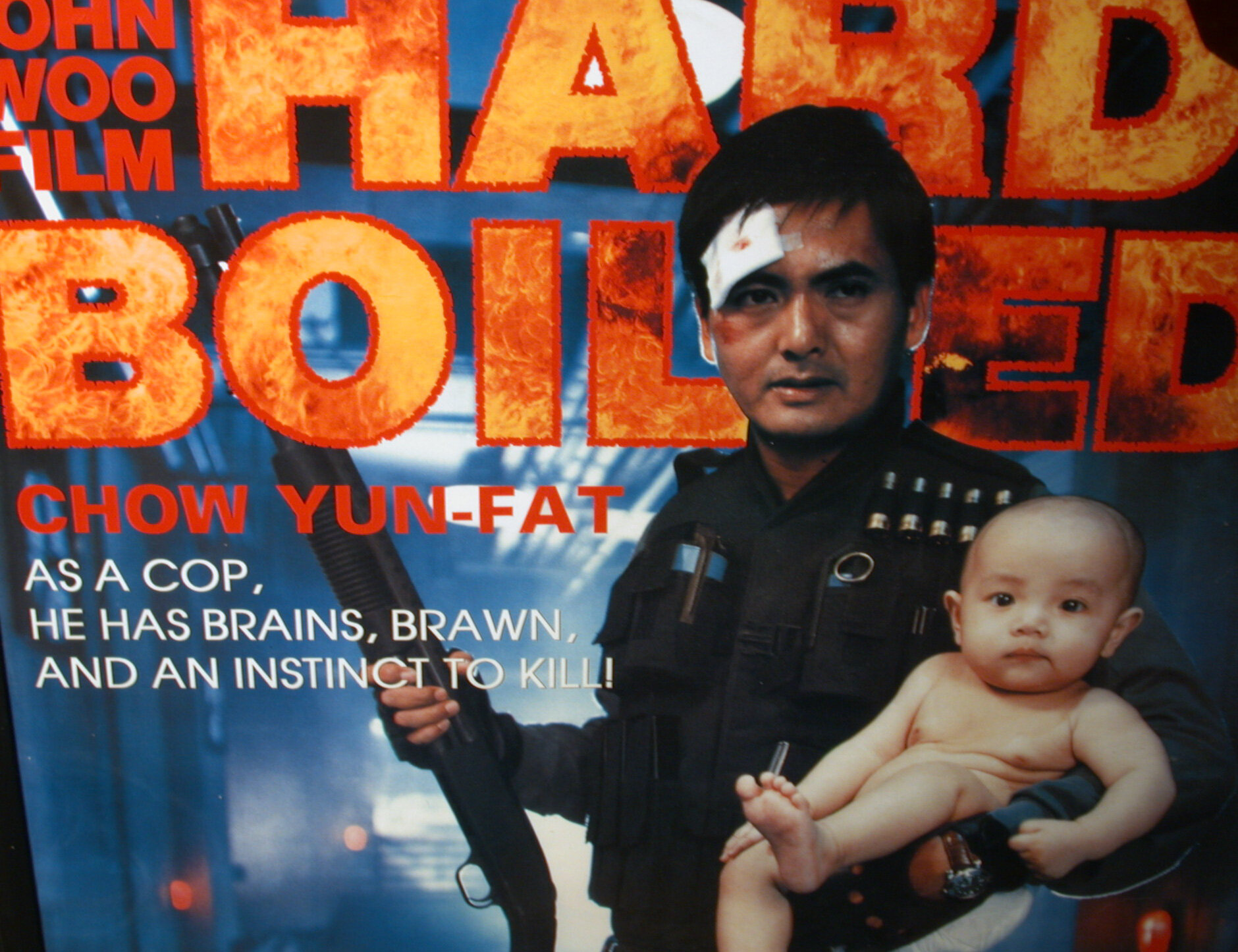
Another real-world example from my own history of discovery: In 2003 I snapped this photo of possibly the greatest movie poster ever printed, but accidentally shot a second exposure as I moved the camera away, capturing some streaky motion blur. Of course I tried blurring the sharp photo to match the streaks in the blurry one, but performing the blur in the native sRGB gamma of the camera JPEG resulted in a muddy blur, thanks to the perceptual mixing. But wrapping the synthetic blur in that sRGB → linear → and back pipeline makes it a near perfect match.


There’s one more experiment you can easily perform yourself to see light winning through your viewfinder: print a fine checkerboard, and photograph it both in and out of focus.
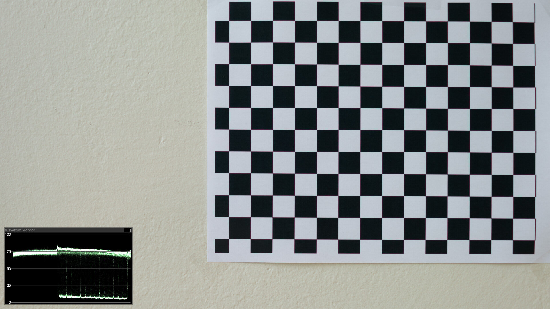


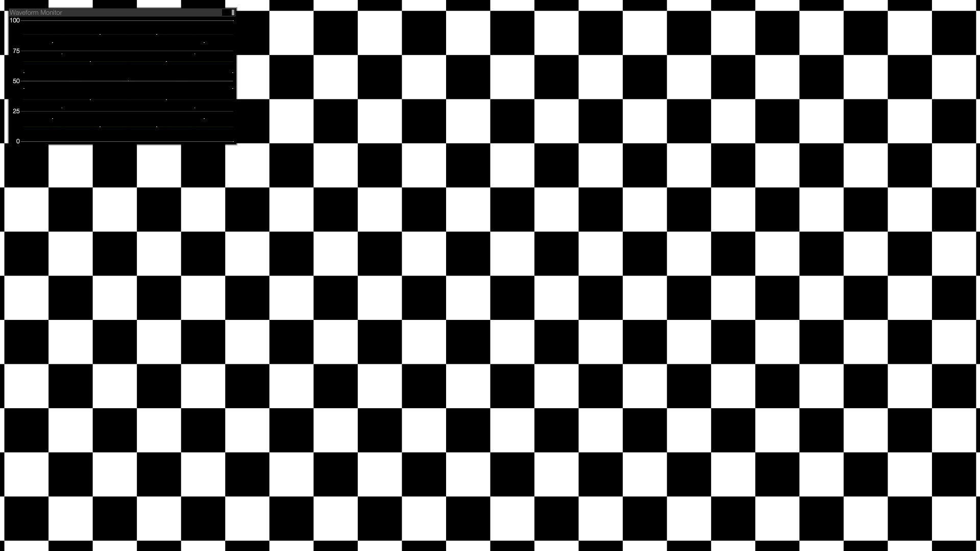


Blurred in display space, the checkerboard converges to a logical 50%. But in linear-light, the checkerboard smudges out to something brighter than 50% (0.5 ^(1/2.2) = 73%), just like the real photographed sample.
The history of my advocacy for a linear workflow has been full of examples like this. Motion blur, defocus blurs, simple compositing operations, 3D lighting and shading, combining 3D render passes or live-action exposures, even anti-aliasing of text, all look better, more organic, and more realistic when performed in gamma 1.0.
Linear Light & HDR are BFFs
In both the real world and in gamma-managed image processing, light overpowers dark. And so far we haven’t even broached the subject of HDR. When you add the ability to process pixel values greater than 1.0, light has even more opportunity to “win,” clobbering other elements in the mix.
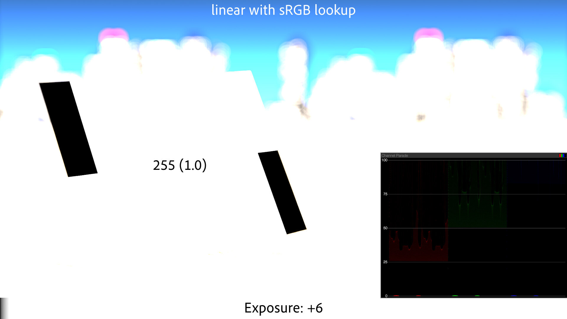
Back to that Gray Card
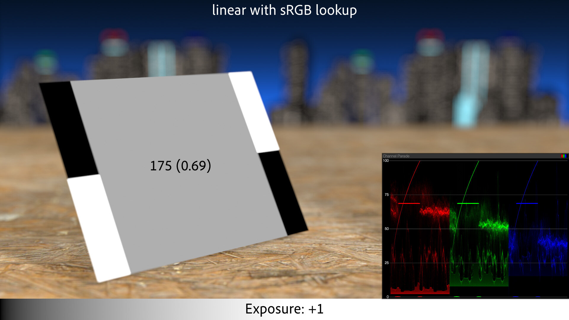
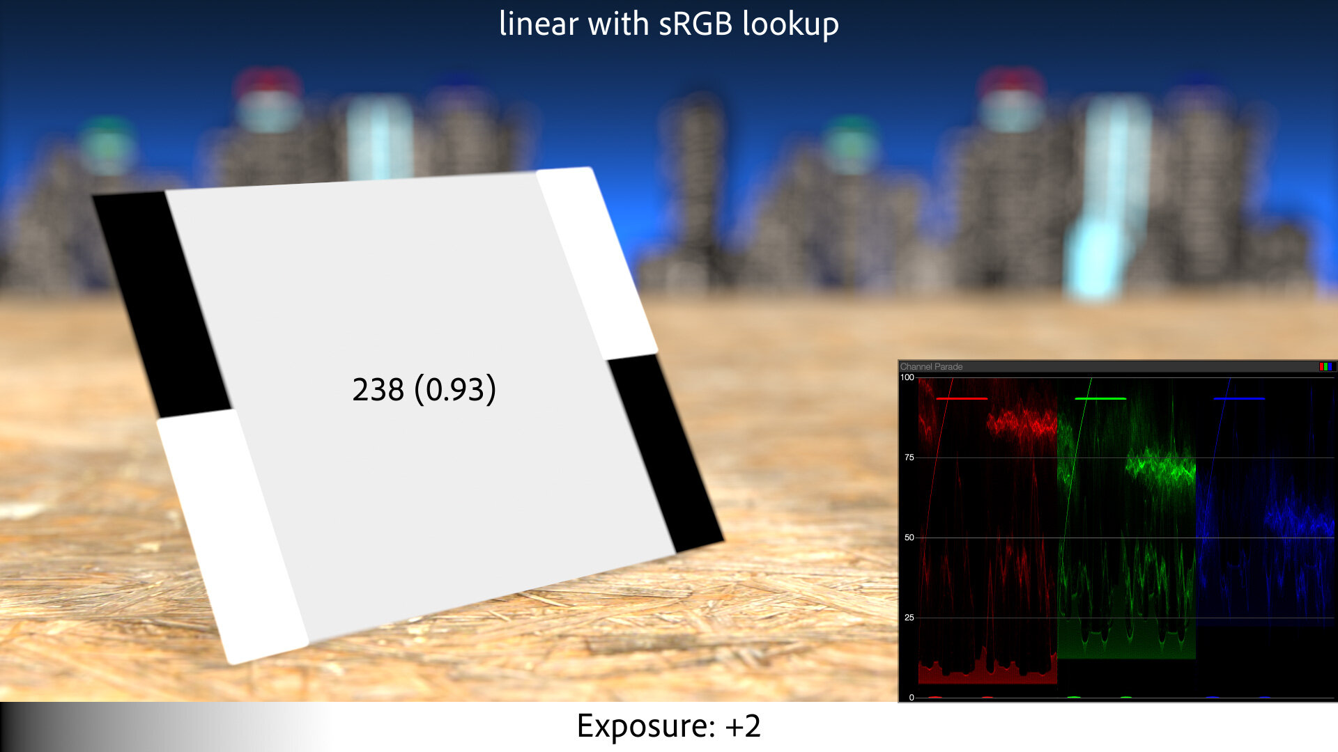
To create a linear-light version of that gray card example, 2005-style, we apply an sRGB-to-linear conversion to the textures in the scene. We then perform the exposure calculations as above, but this math is now happening on linear-light pixels. The final step is to convert the results back to sRGB, using an linear-to-sRGB lookup. Without that lookup, the linear images look too dark on our display, like the deer example above.
With the sRGB lookup, the textures round-trip perfectly. 50% gray is still 50% gray. But the defocused background looks better, because highlights are “winning” in the boke calculations, just like real light does.
And when we start to increase exposure, we get a much more plausible sequence of increasingly-bright images:

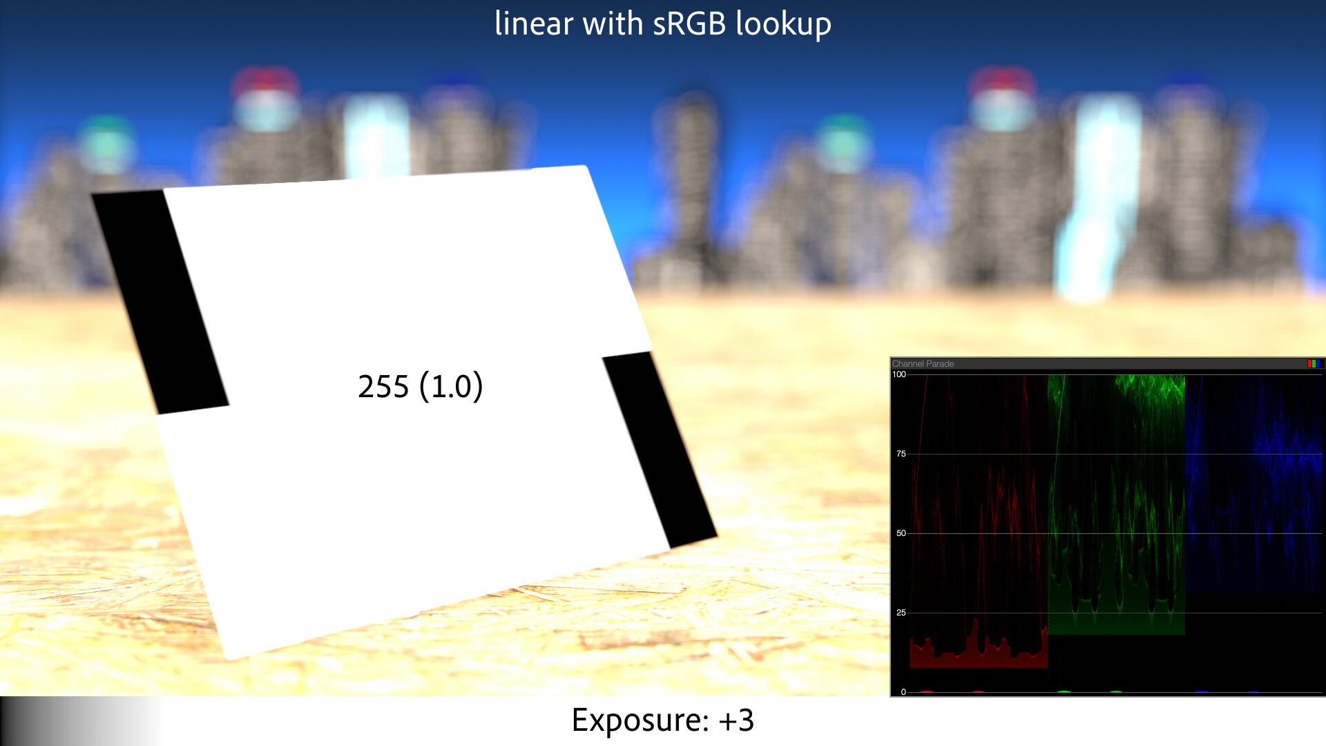
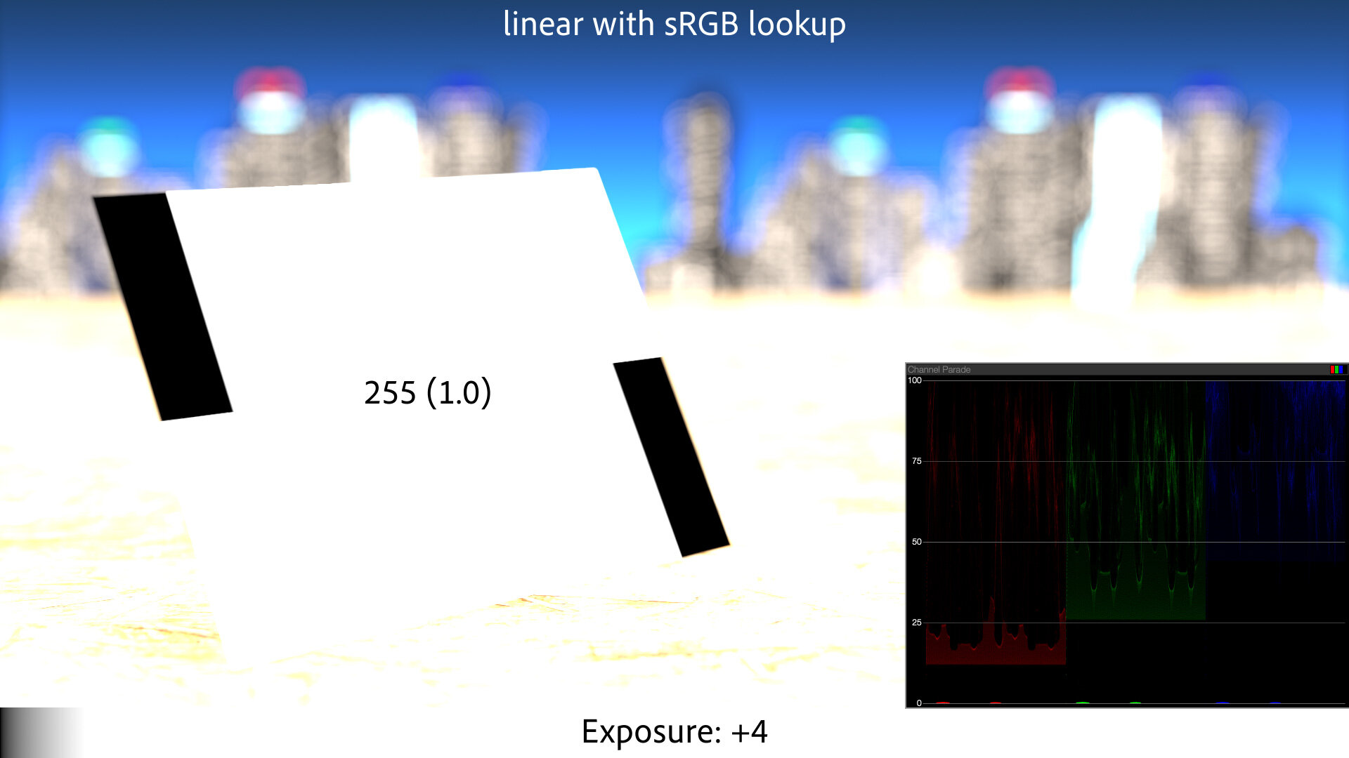
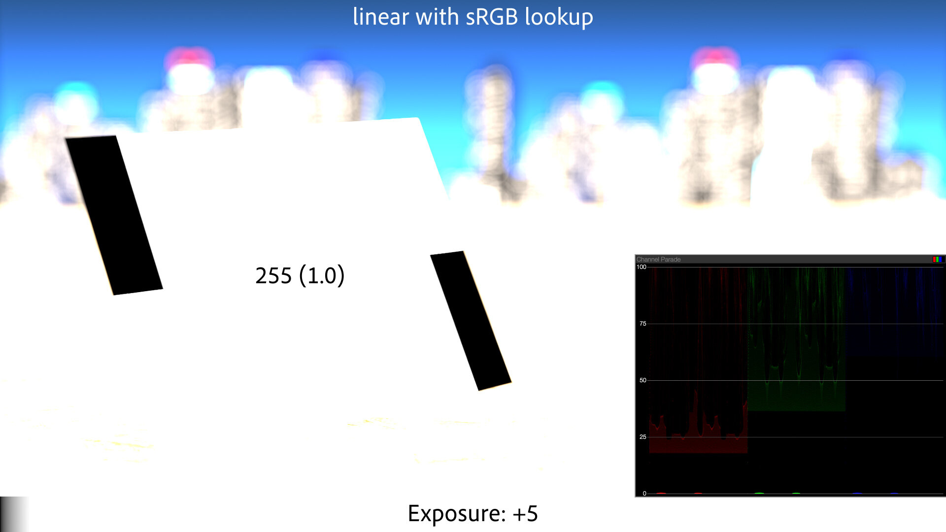
Plausible — but maybe not the most pleasing. The sRGB curve is basically just a gamma curve, with a little straight-line portion at the base. If you have a camera that actually used this tone curve to map its linear sensor data to a JPEG, you would not love the results. They would appear flat and be prone to color artifacts as the channels clipped.
Here’s a real-world example for comparison — in-camera JPEGs shot with a Canon 5D Mark III:

The DSLR, even in sRGB JPEG mode, holds detail in the gray card at 3+ stops of overexposure in this case.
This is because when Canon says these JPEGs are “sRGB,” that defines their correct profile for display, but not necessarily their exact encoding. The encoding profile — the color adjustments and tone curve used to convert the linear raw sensor data to a viewable image — may be based on the sRGB curve, but it has some subjectivity baked into it; likely a little bit of s-curve contrast, and some highlight rolloff.
And that’s with the “Standard” Picture Profile, sRGB, and JPEG — likely the least dynamic range this camera would ever present. A raw file, log video, or even a less-contrasty profile could offer a significantly gentler highlight treatment.
If you work in linear-light, you’re doing things right — but if you want your results to look pleasing and/or photographed, an sRGB lookup alone is not good enough.
sRGB and Gamma Visualized
Before we skewer the sRGB “gamma” as a view transform, let’s examine what it actually is.
First, some terminology. Strictly-speaking, gamma is a power function. A gamma of 2.2 is the same as raising the pixel value, on a 0.0–1.0 scale, to the power of 1/2.2. But the term gamma has been broadened by some to include any kind of 1D tone curve applied to, or characteristic of, an image. Life is easier with this relaxed definition, so that’s how I use it.
Gamma Management is the term I use for a workflow that uses 1D lookups/conversions between formats. Magic Bullet Looks 5 and Supercomp 1.5 use Gamma Management rather than full color management.
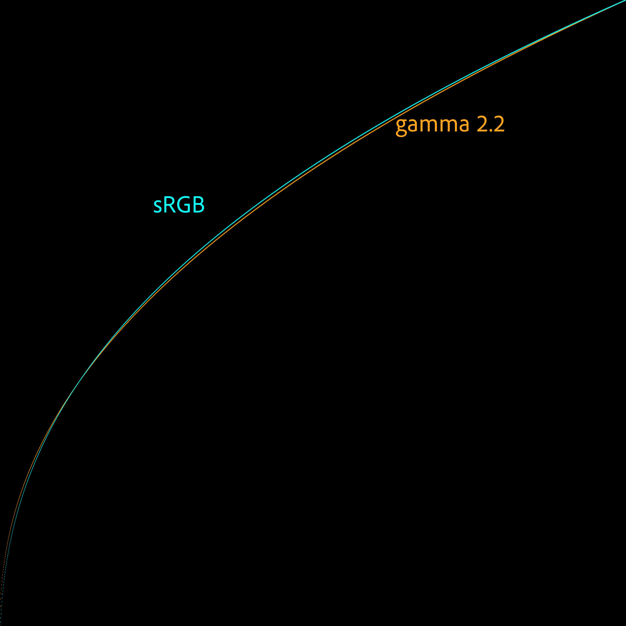
You can absolutely gamma-manage your workflow using the pure gamma-2.2 and its inverse. But if your imagery is sRGB, it’s slightly more accurate to use the sRGB curve. The sRGB tone curve is a very close match to a pure gamma 2.2, but it has a little kink at the bottom to solve an old problem.
A pure gamma curve has a slope of 1.0 or 0.0 at its base, i.e. as the values in the image approach zero, the gamma curve approaches a flat line. This means that calculations on the darkest pixels in your image could be inaccurate, and those inaccuracies could compound through multiple steps of linearization and de-linearization.
sRGB has a steep, but not infinitely steep, linear slope at the very bottom, and then the rest of the curve uses a gamma of 2.4 squished to fit in the remaining range. The clever result is that the curve is smooth at the transition and robust through multiple generations of processing, even if the processing is not done in floating-point.
It’s easy to see how similar the gamma 2.2 and sRGB curves are by graphing them:

Tripping on Round Tripping
While the pure gamma curve and the sRGB curve are similar, two values for which they are identical are zero and 1.0. That’s fine, although there’s nothing special about 1.0 in either curve in the sense that the power function extends naturally through 1.0 and operates equally well on “overbrights,” or HDR values greater than one.
What is significant about these curves and their 0.0–1.0 range is that they round-trip cleanly, as I mentioned above. If you linearize with the inverse of these curves, do your thing, and then de-linearize, the pixels that didn’t get blended go right back to their original values. This is convenient, and for some motion-graphic applications, essential.
However, it’s the reason working linear is not enough.
Rendering a White Thing
Here’s a simple rendering to show what I mean. The first image is rendered using a simple Blinn-Phong shader in display-referred space, just like I used to do on my Amiga. The second is that same scene but with simple sRGB gamma management.

While the linear-workflow image above looks “better” within the limitations of this intentionally simple example, it doesn’t solve the clipping from the gamma-space version, in part because of this prioritization of round-tripping white.
No object is really “white” in the sense of reflecting 100% of the light that hits it. But we often work with synthetic images that have pure white in them (such as logos or text), and of course we expect those values to remain pure white even after round-tripping through an sRGB or gamma 2.2 linear workflow.
But at the same time, we expect our cameras to have that gentle roll-off. We expect a white object to photograph not as pure white, but as some reasonable white-ish shade that is not blown-out. In fact, from modern cameras, we expect enough dynamic range to capture a sun-lit shiny white car, for example, and shadow detail on a person’s face.

An unused take from Circle of Stone, directed by Mark Andrews and shot by me. As an experienced cinematographer, I would approach challenging lighting situations like this — with the bright white car surfaces and deep shadow detail — by pointing the camera and praying.
There’s a lot of detail in this shot, and a lot of challenging exposure. We can actually inspect the exposure values, because this shot was captured in log. This also means we can accurately convert it into linear-light values, and then render it with a simple sRGB curve:


Why would we do such a thing? The results, as you can see, are terrible. When you pass scene values to a simple sRGB lookup, with no other “display prep,” as cinematographer Steve Yedlin calls it, you get ugly results. Low dynamic range, clipped highlights, and posterized colors near areas of overexposure.
In fact, this synthetic example reminds me of early digital cameras that lacked the dynamic range to create a proper highlight rolloff. The overexposed waves in this Nikon CoolPix 995 photo from 2003 have the same harsh transition to white through posterized cyan as the sRGB-converted car above:
I paid $1,000 for this camera in the year 2000. This photo is 2048 x 1536. So, 1K for 2K in Y2K.
Rendering to linear scene values and then converting them to sRGB with the stock curve is ugly. If a modern camera did this, we’d laugh it back to 2003.
But this linear-to-sRGB (or gamma 2.2) final lookup is exactly how a lot of artists have been doing things “right” for years. We learn that we should work linear, so we dutifully convert our textures to gamma 1.0 and render to EXR. But if we use nothing more than the sRGB curve as our final lookup, we are treating our beautiful 3D rendered scenes as if shooting them with a first-generation digital point-and-shoot.
The industry’s standardization on this kind of simplistic linear workflow has left an aesthetic gap demanding to be filled.
Roll Out the Roll-off
When I was designing Magic Bullet Looks, and later Magic Bullet Colorista, I was aware of these issues. Magic Bullet Looks has always done its processing in linear floating-point values, which meant that it was possible to both manage and create HDR values, even back when no camera could generate them.
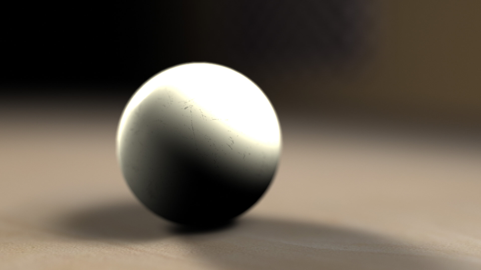
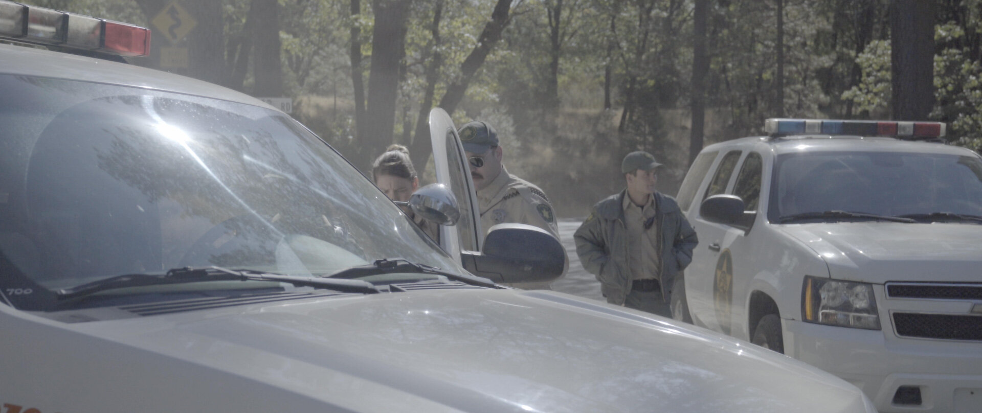
One thing we came up with to help render bright scenes in a more pleasing, film-like way was the Shoulder tool in Magic Bullet Looks.
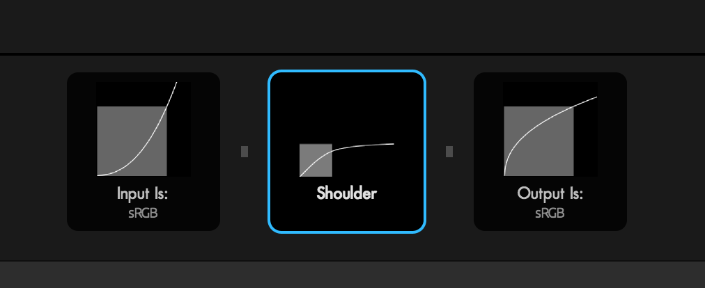
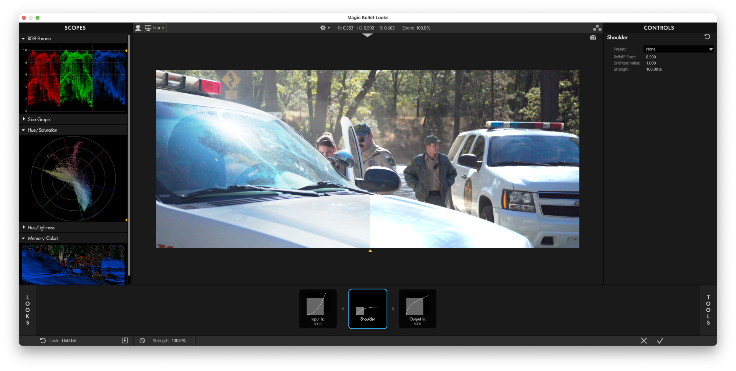
Like many tools in Looks, Shoulder shows you exactly what it’s doing — in this case, smoothly mapping the brightest values in an image to asymptotically approach a maximum. The Highlight Rolloff control in Colorista V packs the same process into a single slider.
Let’s take a clear look at the effect Colorista’s Highlight Rolloff has on our example:


And on our simple rendered ball:


Highlight Rolloff is a nice, easy way to add a film-like “shoulder” to your HDR imagery. If you are using the gamma 2.2 “linear workflow” option in Cinema 4D, adding the (now built-in) Magic Bullet Looks Shoulder tool to your rendering is an easy way to create more pleasing highlights without radically changing the look of your renders. It’s the first step in upgrading our virtual cameras to match the expectations we’ve come to have of our real ones.
But can Highlight Rolloff alone solve all our rendering issues? No. And the easiest way to show that is by
Rendering a Blue Thing
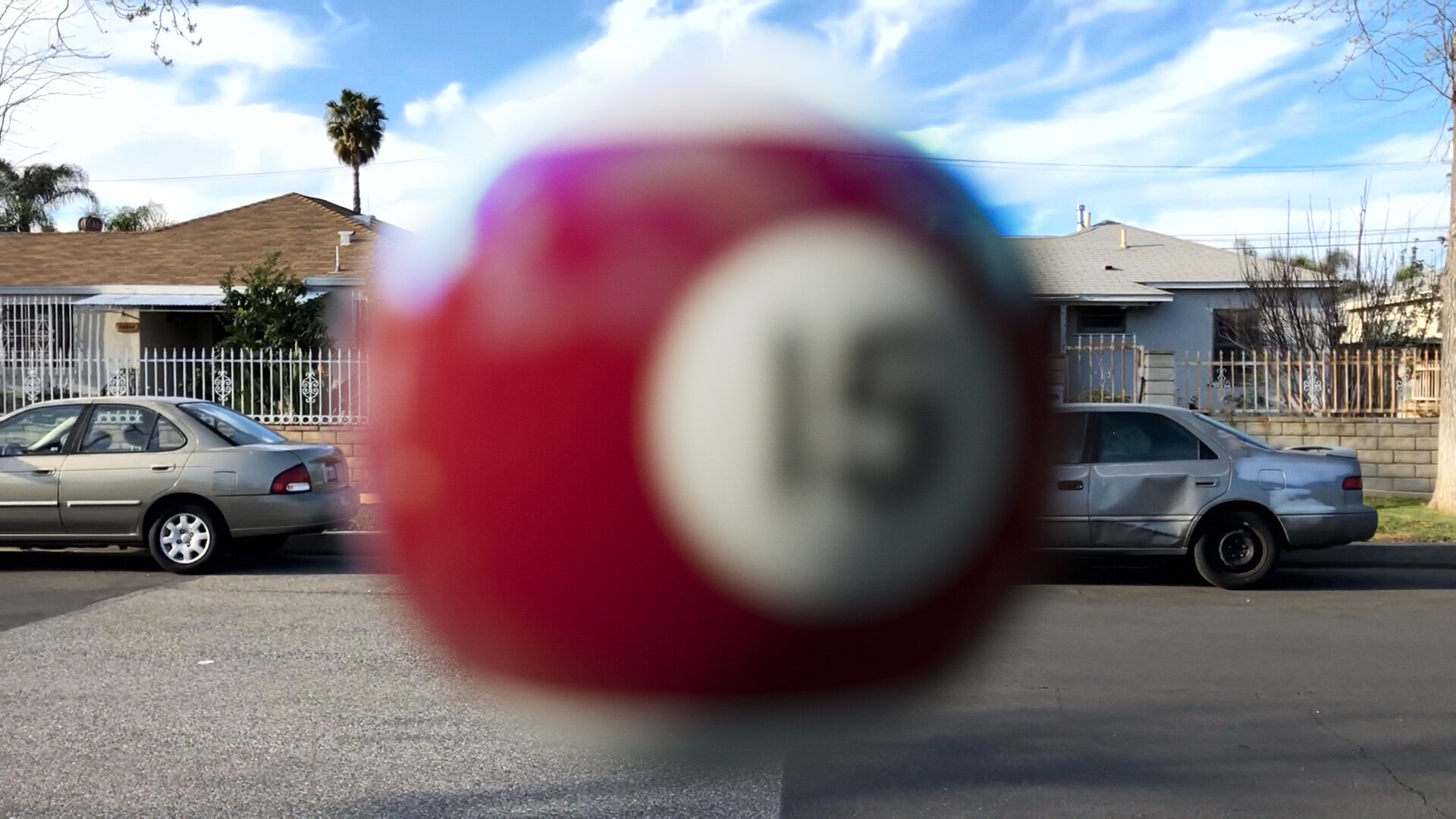
Here’s that ball again, now textured blue.
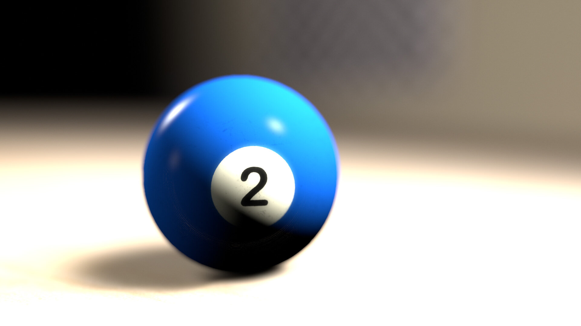
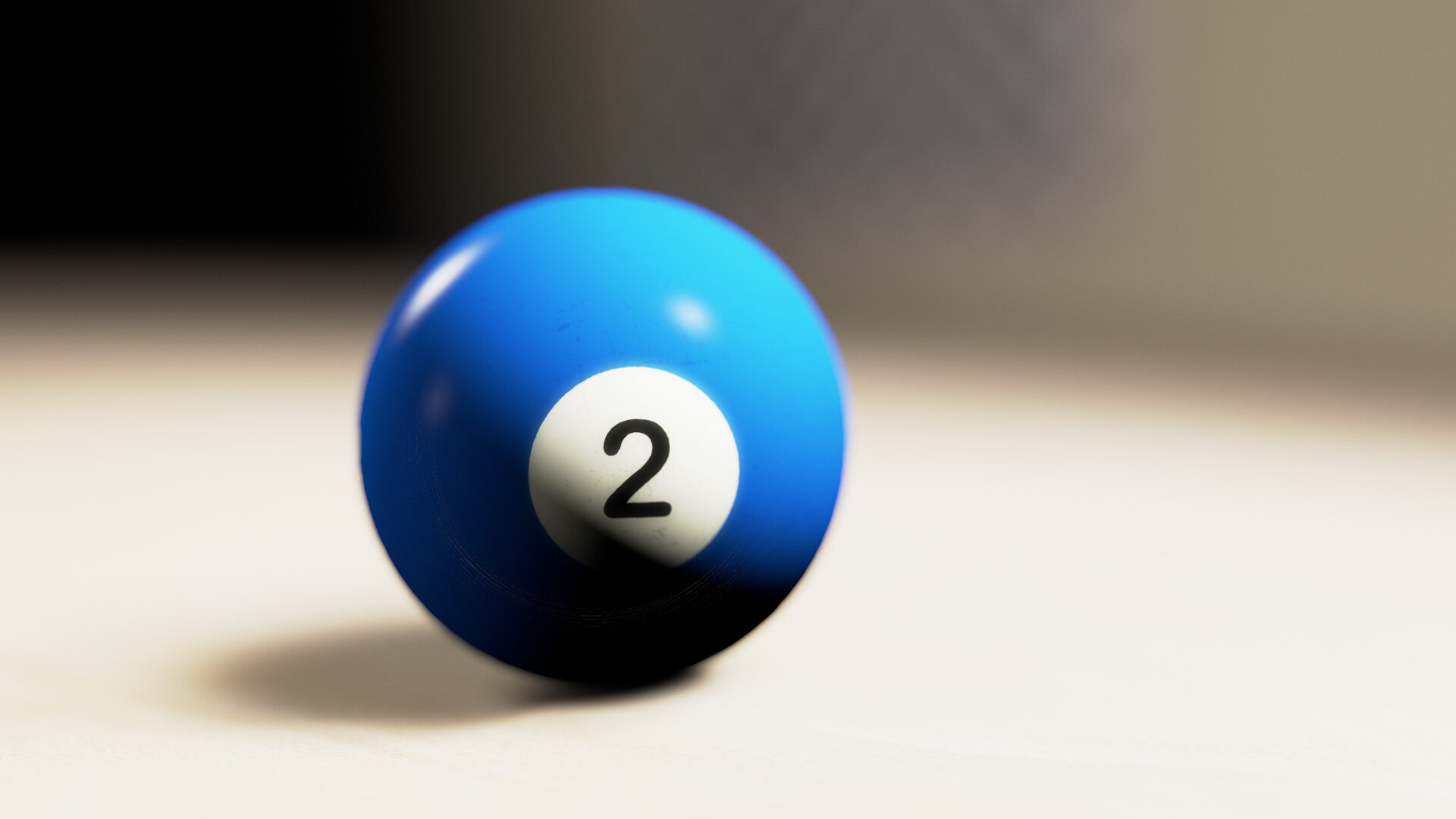
Again, you can see the failings of the sRGB version (clipping and posterizing of highlights) are addressed, if not fully eliminated, by the Highlight Rolloff.
But what if we change the color of the light?
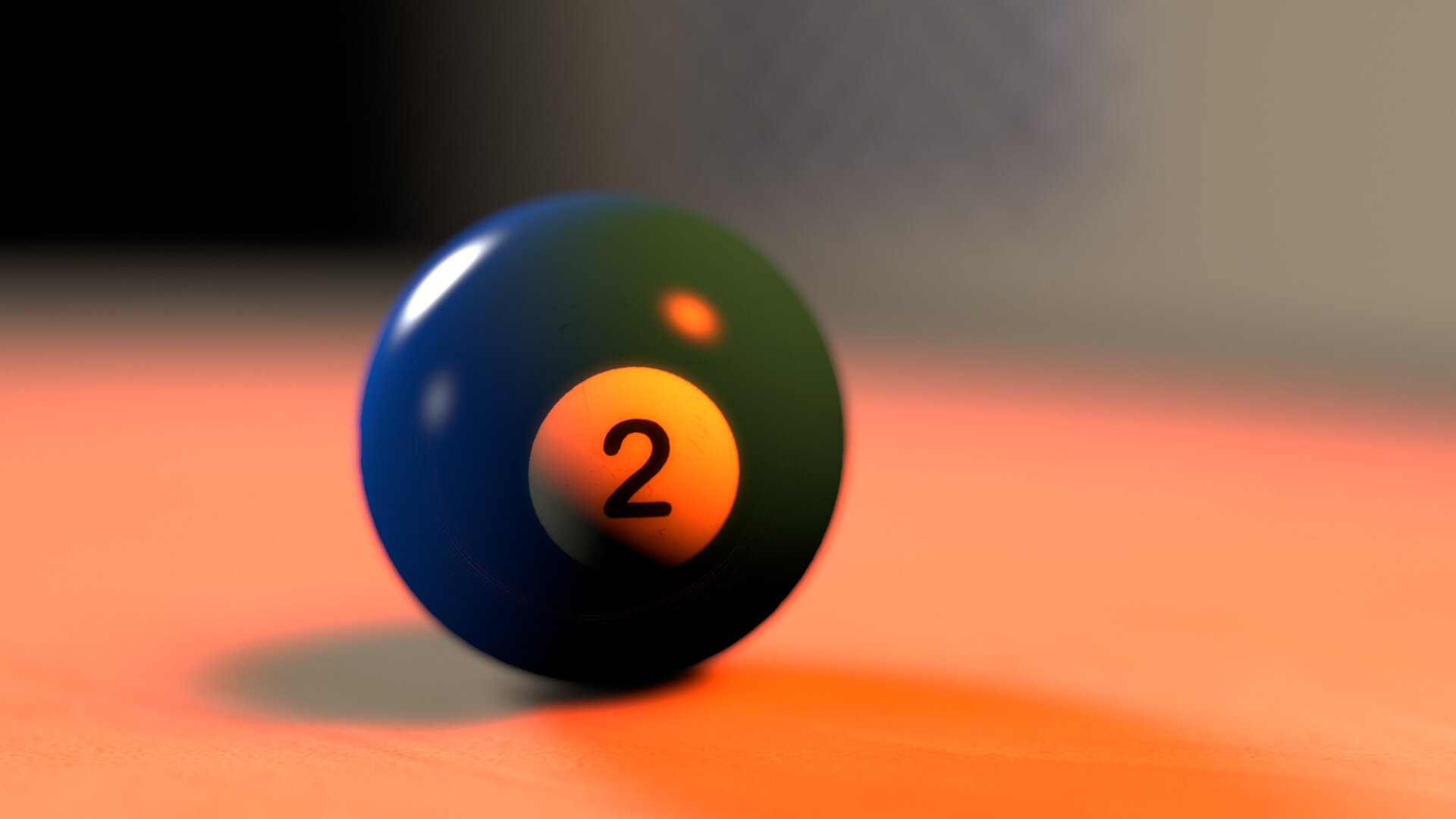

This does not look good. The very red light seems unable to illuminate the not-quite-pure blue of the billiard ball, instead tinting it a weird green.
If that feels wrong to you, but you can’t quite figure out why, let’s look at a real photo of a blue thing lit with red light:
The illuminated portions are purple, not green.
Highlight Rolloff, you are awesome, but you are not enough. The aesthetic shortcomings of sRGB view lookups are now joined by this bogus color rendering. There’s both an artistic and technical void here to be filled — and you guessed it, ACES is what’s come along to do so.

ACES: Come for the Technical, Stay (or Don’t) for the Subjective Aesthetic
What, exactly, is ACES? For the purposes of this article, here’s what I want you to know:
ACES is a color management system
ACES specifies a methodology for converting images among various color spaces. It is specifically designed for the motion picture industry.
ACES is a color space. Well, two.
ACES2065-1, or AP0, encompasses the entire CIE diagram. ACEScg, or AP1, is a carefully-chosen subset.
ACES defines two color gamuts, AP0 and AP1. AP1 is the “working” gamut, and like AdobeRGB and ProPhotoRGB, it is a wide-gamut color space, encompassing more colors than sRGB.
ACES includes color profiles for many popular cameras.
ACES ships with profiles for Canon, Sony, ARRI, Red, and more. This means it’s trivial to match the output from various cameras.
ACES includes an evolving set of final lookups for presentation.
For that final conversion from the linear-light, wide-gamut working space of AP1, ACES offers a handful of Output Display Transforms, or ODTs. The ones designed for SDR video output have built-in highlight rolloff, a subtle contrast curve, and special handling for bright, saturated colors.
ACES is a gentle prescription for a workflow.
The core ACES color profiles are designed to support the phases of a motion picture project:
ACEScg is the linear, AP1 color space designed for 3D rendering and compositing.
ACEScc is a log color space that also uses AP1 primaries. It is designed to be a universal space for color grading.
ACES2065-1 is intended to be a universal mastering color space for sharing and archiving finished projects. This is where that AP0 gamut comes into play — it encompass every color visible to the human eye.
The Technical
ACEScg is a linear-gamma working space of course, so it’s ideal for rendering and compositing. But that it is also a carefully-chosen wide-gamut color space is an equally important part of its design. Rendering in a wider-gamut space is one way to combat the green ball problem above.
The Subjective
Once you choose to work in a wide gamut, you then have to figure out how to map that image back to various output formats. As we have established, the simple sRGB transform (and its cousin, Rec. 709) is not good enough. The ACES team performed numerous tests and evaluations in designing their output transforms — and then revised the results several times. And they are still working on it. The look of these transforms is both studied and subjective, and while many people love the look, others have criticisms (especially around rendering of saturated colors). Remember above where I said that a simplistic linear workflow had left an aesthetic gap to be filled? Well these Output Display Transforms (OTF) are the primary way that ACES has stepped up to fill it. This explains why folks are so enthusiastic about the results it gives them, even if it is an ongoing field of development.
One of the most exuberant advocates of ACES for 3D rendering is Chad Ashley of Greyscalegorilla. Here’s a typical before/example from one of his excellent tutorials:

Image courtesy Grayscalegorilla. Watch the tutorial.
That is a pretty solid mic-drop of a comparison there. You can see how the ACES example has both the pleasing push of contrast we associate with film, as well as the smooth, languorous highlight rolloff. Colors are somehow both rich and restrained. The render looks real, but more importantly, it looks photographed.
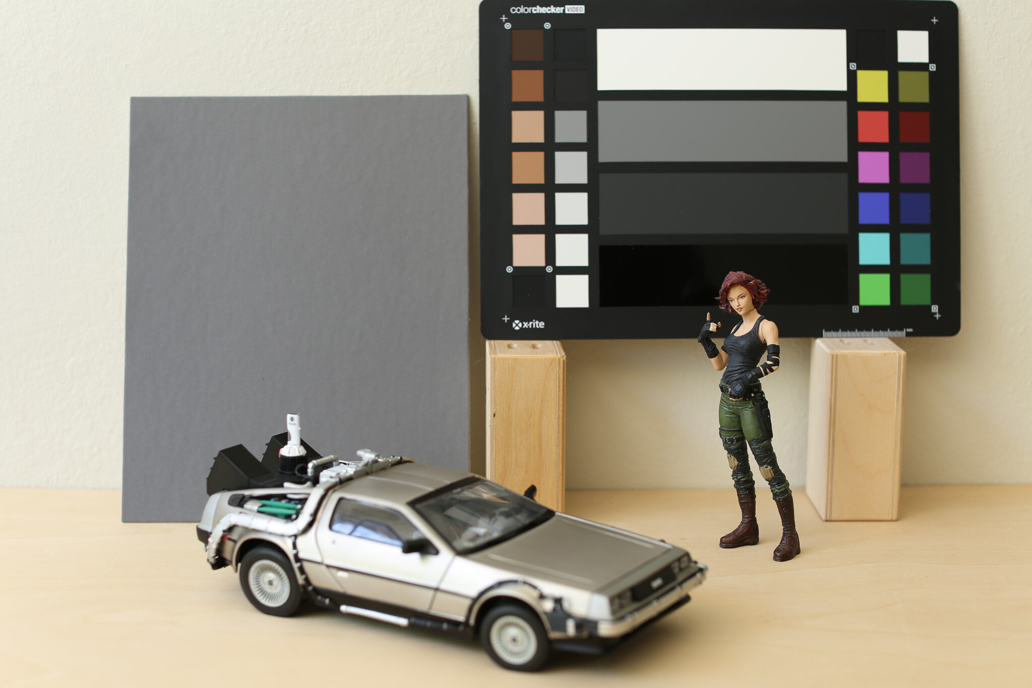
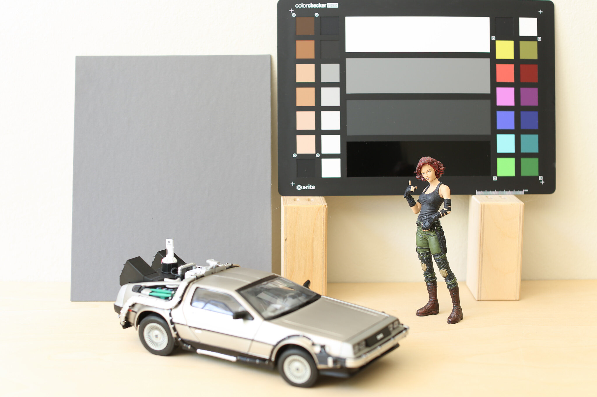
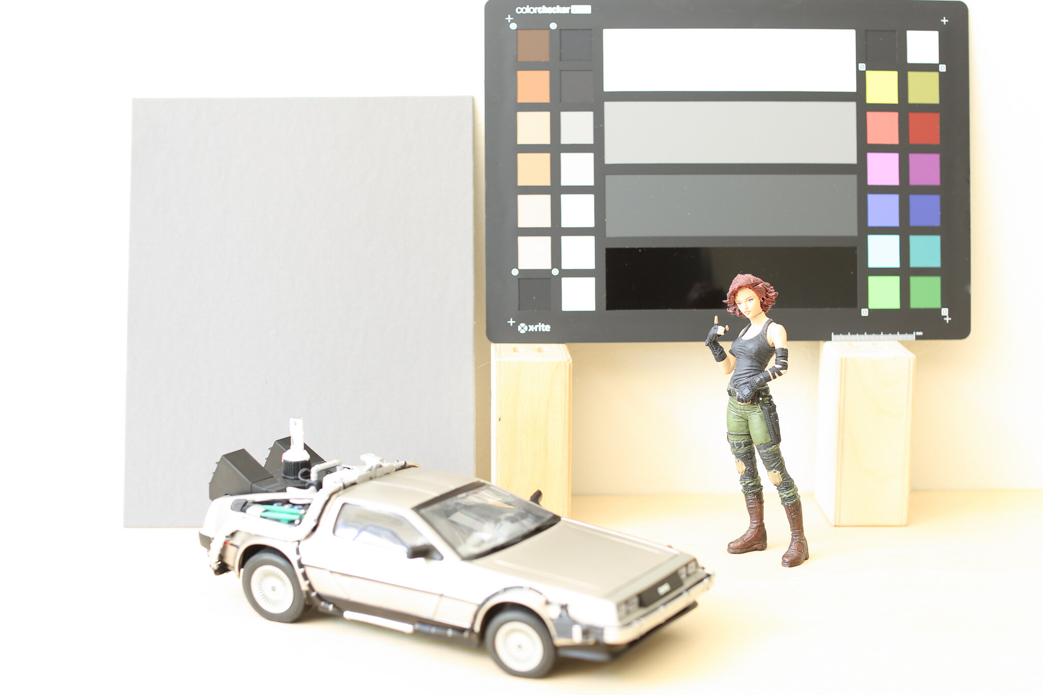
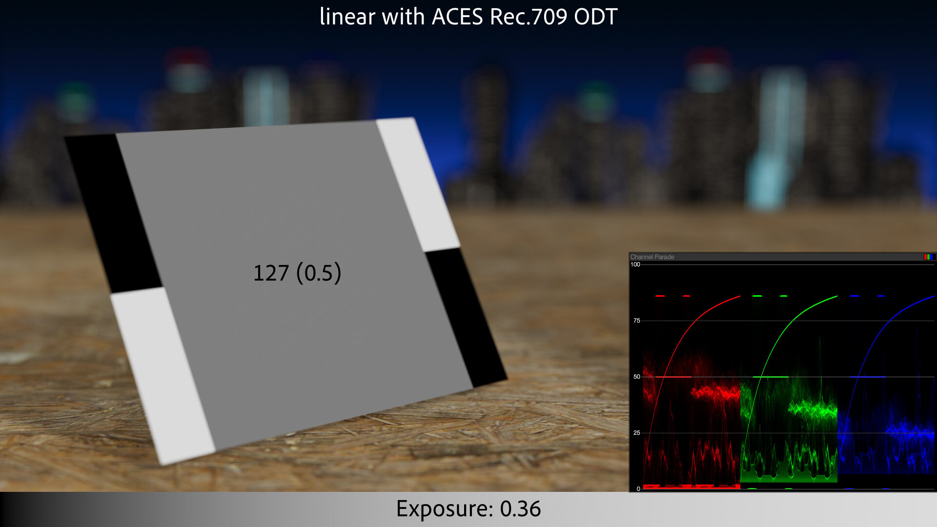
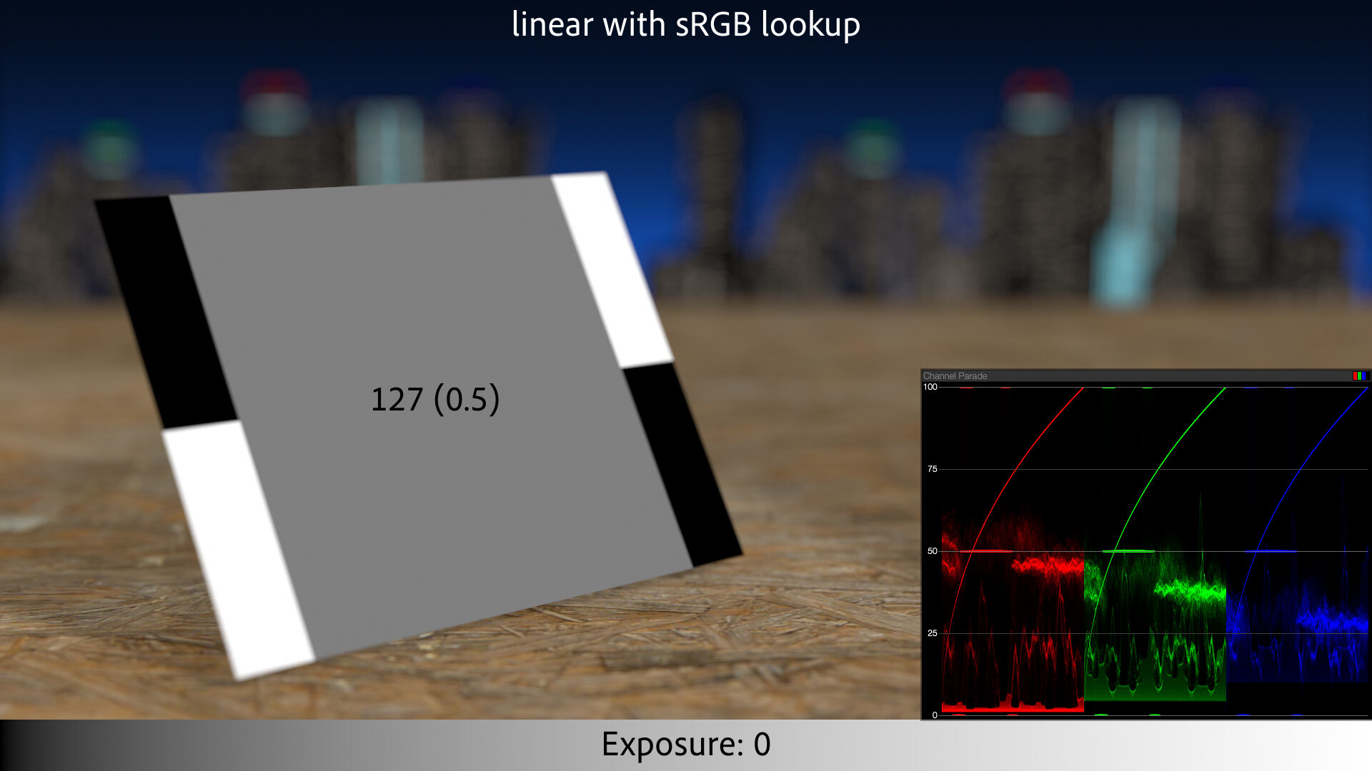
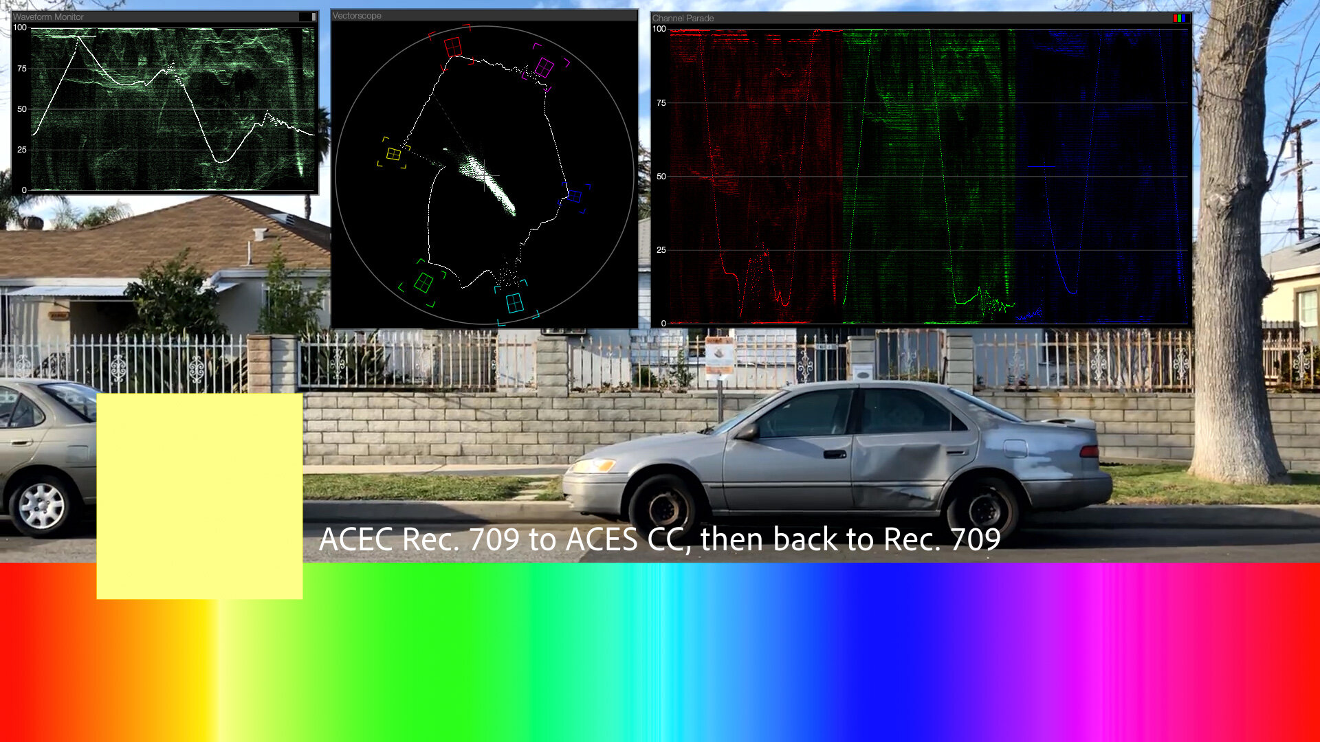
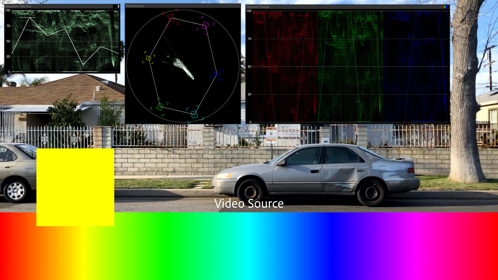
Let’s do the same comparison with our gray card example from the top of the article:


To be clear, what makes the right side of the split an ACES render is a combination of transforming the textures into ACEScg linear, and then applying the ACES Rec. 709 ODT as a final view/encode transform. And while it looks fine, the contrast and highlight rolloff do make for an overall darker image. This is probably a much more realistic portrayal of the scene. The pure white patches on the card, which are far “whiter” than any real-world surface (fresh snow is about 85% reflective) render as light gray, and our 50% gray is coming in at 43%.
The “gamma,” or tone curve, of the ACES Rec. 709 ODT shown in magenta. It’s easy to see how it is darker overall than the sRGB curve (cyan).
Boosting ACES Rec. 709 by 0.36 EV causes 50% output to match sRGB. Note how similar the Colorista Highlight Rolloff variant of sRGB is to that boosted ACES curve.
To compensate for this, it looks like Chad Ashely rendered his scene a little brighter. The non-ACES version looks overexposed. Let’s boost the scene exposure so the gray card matches the sRGB example:
With gray matched, we get a better overall comparison. The contrast and soft highlights look nice. It’s a more photographed-looking version of our idealized scene.
What it is not, however, is a safely round-tripped version of our texture maps. Where the sRGB linear workflow mapped black back to black, 50% back to 50%, and impossible white right back to 1.0, this more realistic portrayal reminds us more of the real-world photography of the white cars. We see the bright white things as “white,” even though they are no longer pegging 255 on our displays.
What about our motion blur example?
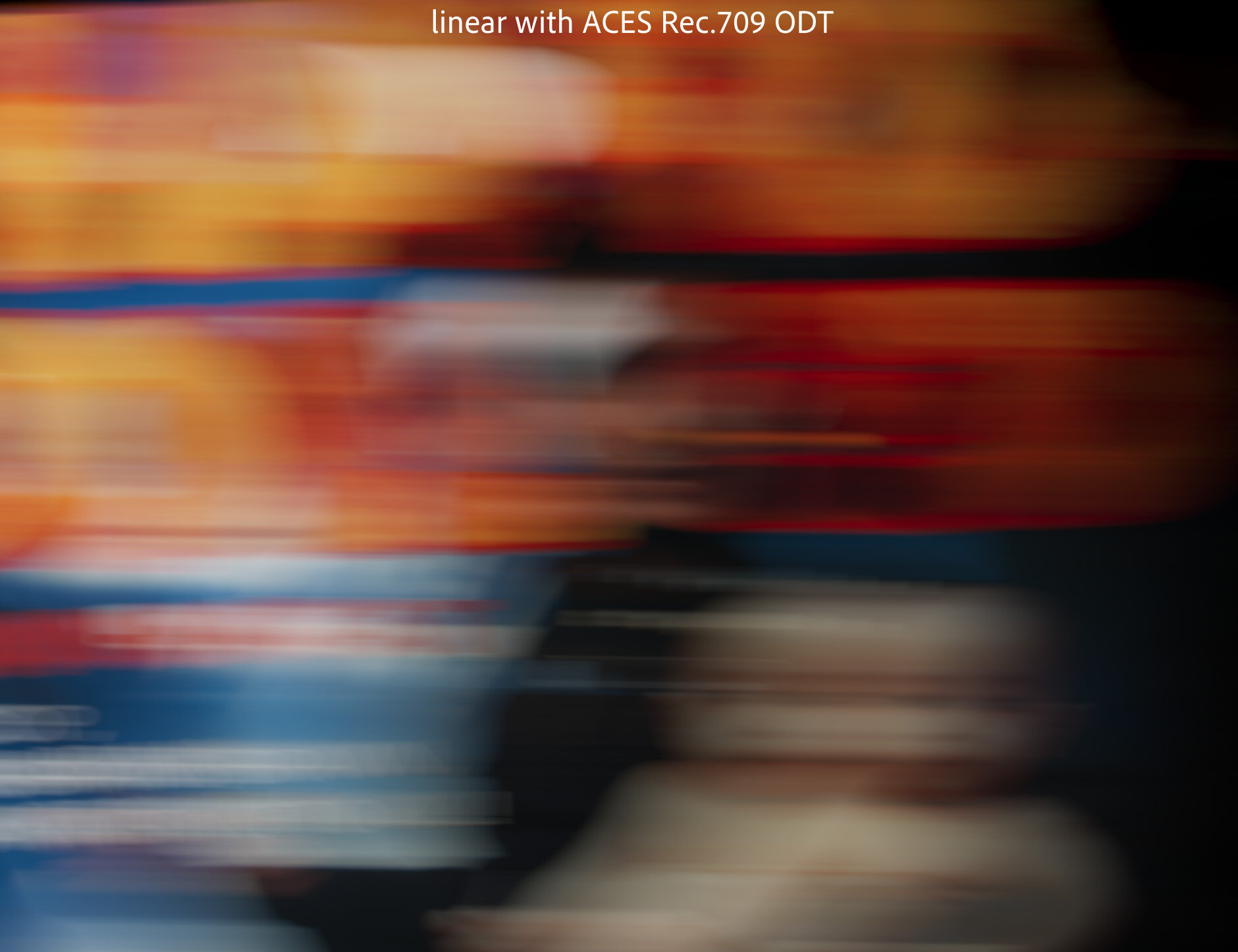
Here ACES has let us down. By rendering the linearized image with the photographic contrast and highlight compression of the ODT, we’ve lost our seamless round-tripping. Our results are dark and dull. Because we knew what we expected our texture to look like at the end of the pipeline, the pleasing, subjective look of the ODT was not the right choice for this example.
This is meaningful for motion graphics, color grading, and compositing workflows. If “working in ACES” means changing the look of every pixel before you’ve even started to get creative, that’s going to surprise and dismay many artists.
For example, if Chad was trying to render his realistic vase in front of a client-supplied background plate, the same post-processing that he loved on his CG would mute out the photographed background.
Oh heck let’s look at that:


The sRGB rendering on the left, composited over this SDR iPhone video, has the typical sRGB artifacts covered above: clipped highlights and posterized colors near white. While the ACES rendering on the right solves these issues, it applies that same highlight compression to the SDR background, making it look dingy and dull.
If we want 3D rendered scenes to look photographed, do we have to let go of round tripping?
Oh Inverted Display Transform
Every ACES conversion requires at least an input color profile and an output.
ACES has a solution for this too. You’ll remember that ACEScg is our working space for rendering and compositing. It therefore is also our texture map color space, so in the example above, I’ve converted the billiard ball texture map and the SDR background plate from sRGB into ACEScg. I did this using the Open Color IO effect in After Effects, setting sRGB as the input, and ACEScg as the output. But critically, ACES also allows for using the contrasty, soft-highlights Output Display Transform as the “from” in this conversion. In other words, you can invert the output transform for images you want to cleanly round trip.
Using the Output Rec. 709 profile as the input, AKA inverting the ODT.
Given how complex the ACES Rec. 709 ODT is, I’m impressed that this is even possible. It’s a straightforward process to invert a 2D lookup, but the ACES ODT is a complex, 3D conversion, with special handling for saturated highlights. Inverting all this not only allows for round-tripping, it also has the interesting side effect of plausibly surmising HDR values from an SDR image.
Think about it this way: The photographed examples we’ve been discussing all have some kind of “shoulder” baked in. Inverting the shoulder-y ACES Rec. 709 ODT effectively un-shoulders photographed images, putting their compressed highlights back into a reasonable estimation of what scene values might have generated them.
Believe it or not, we used to have exactly this functionality in Magic Bullet Looks 1.0. We had Highlight Rolloff in the Output tab, and its inverse, “Highlight Roll-on” in the input tab! People were confused by this, so we ultimately removed it, but now we’ve replaced it with ubiquitous Input and Output tools.

Inverted ODT is not for Texture Maps
The inverted ODT allows us to round-trip video though ACES, but since it does so by creating HDR values, it’s not appropriate for texture maps representing diffuse reflectivity.
This is a big stumbling block for many artists dipping their toes into ACES. Their texture maps suddenly appear dark and dim, like the sRGB background above.
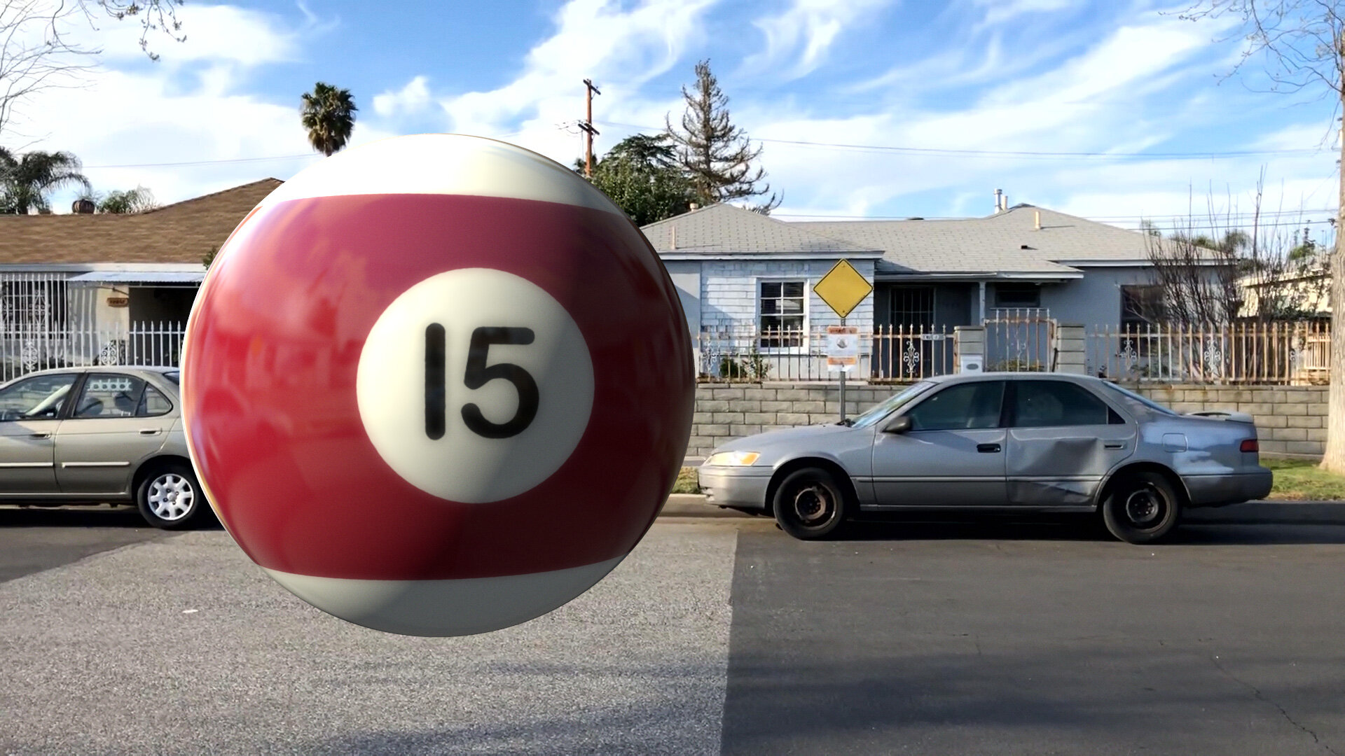
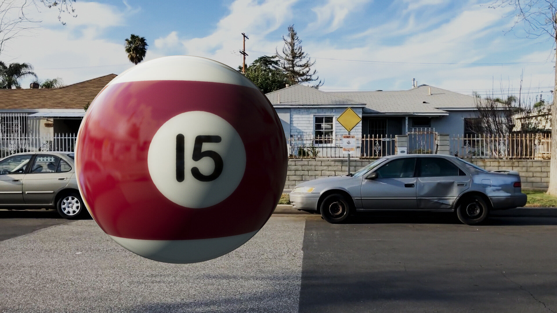
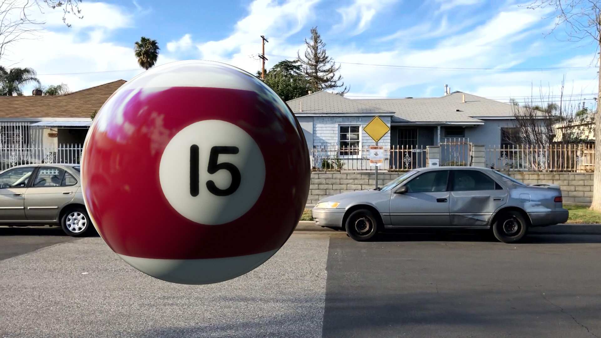
Step through the images below for a simulated example:
Crank Up Those Lights
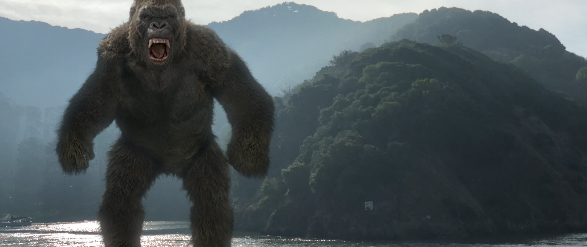
You might have noticed something in the floating billiard ball example above: The ACES ODT so aggressively addressed the clipped highlights from the sRGB example that the resultant render appears a bit flat compared to the plate, which has lots of poppy highlights from the low sun.
When you invert the Rec. 709 ODT, the compliment to the rolloff curve causes 1.0 white to map to a very bright linear-light value: about 16.3 on a scale of zero to one. That sounds aggressive, but it represents about 6.5 stops of overexposure on an 18% gray card (0.18 × 2^6.5 = 16.3) — more dynamic range than the 5D JPEG example above, but right in line with the Sony s7SII log example with the white cars.
Another way of looking at it: It’s not a stretch to presume that the clouds in the iPhone plate are 6–7 stops brighter than the gray side of the dented car.
Artists working with a simple sRGB or gamma 2.2 “linear workflow” have been inadvertently training themselves to use conservative light values, because of the lack of highlight compression modeling high-end film or digital recording. If you lit your scene too bright, you’d get ugly highlights. But real scenes have big, broad dynamic ranges — which is part of why they’re so hard to photograph.
The virtual “sun” light that’s illuminating the rendered ball is set to 300% brightness, but the HDR values that light creates in the render get compressed down so much that I now want to push it more. Here’s the same scene with the light at 1,000% brightness).


If you’re not used to it, setting a light’s brightness to 1,000% feels strange — but in this example, that results in reflectance values of around 10.0, right in line with the HDR-ified highlights in the linearized background plate — as you can see in the underexposed version.
Astute readers will note that if inverting the ODT results in white being mapped to 16.3, then an ACEScg linear value of 16.3 is the darkest value that will be mapped to pure white in Rec. 709 — i.e. you need ACEScg scene values of greater than 16.3 to clip on SDR output.
Rendering to an ACES ODT encourages artists to create higher-dynamic-range HDR scenes, with brighter lights and more aggressive reflections. When you use brighter lights in a modern global-illumination render, you get more pronounced secondary bounces, for a more realistic overall appearance. ACES encourages artists to create CG scenes that better show off the power of modern CG pipelines, and, quite simply, look better, because they better model how real light works.
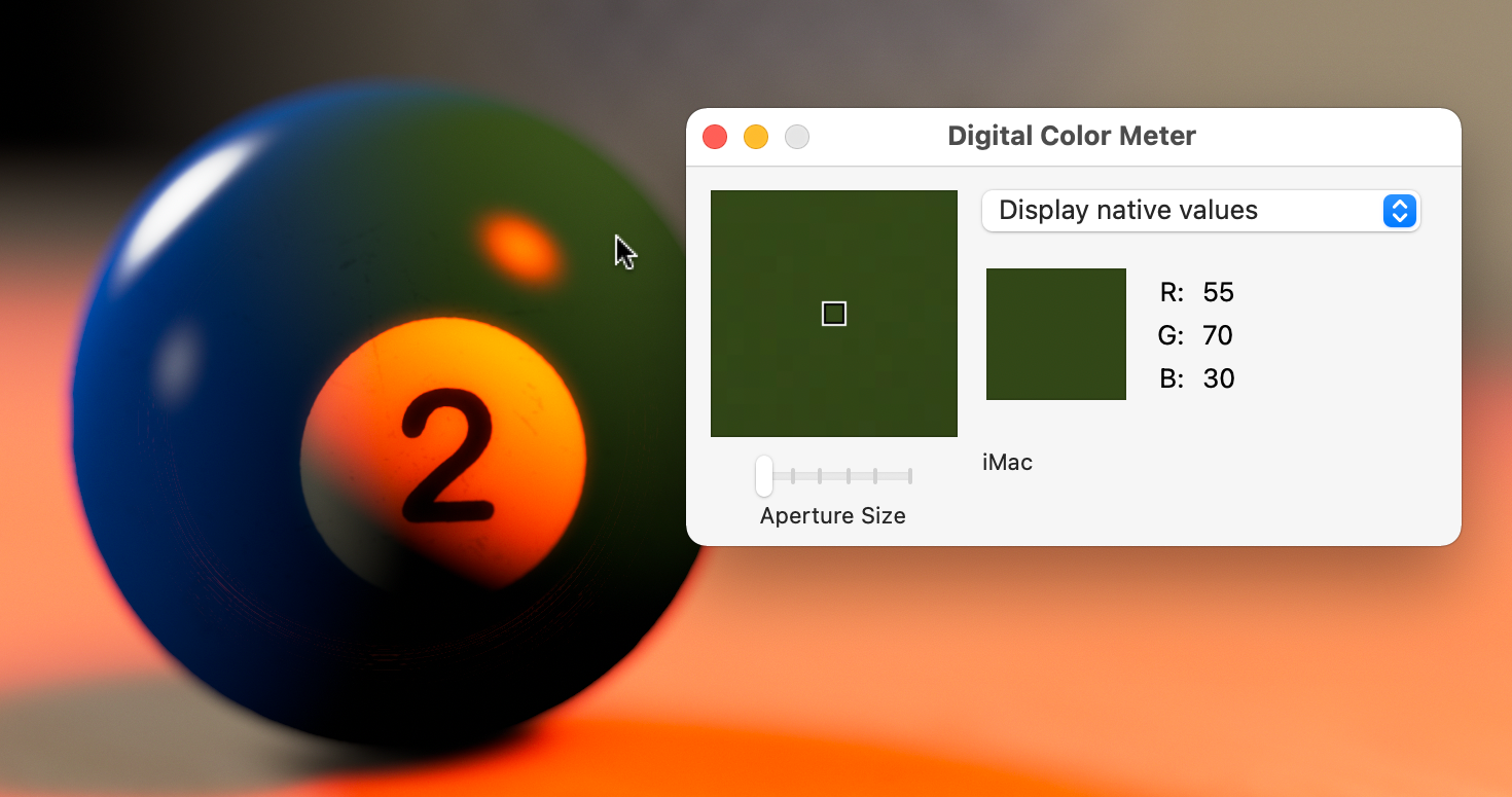
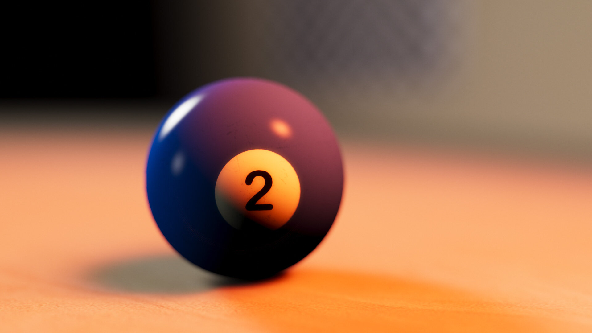
Even if that light is red, and the object is blue.
Back to Blue
Remember our blue billiard ball that went green when hit with a red light? ACES wants to help us with that too.


I’m not really this organized.
That’s sRGB with Highlight Rolloff on the left, and ACES on the right. Look how closely this matches the photographed example of a blue object under red light.
Our sRGB render failed in this case because of its limited color gamut. The saturated blue of our number two ball was near the edge of sRGB’s range of available colors. When we hit it with a strong red light, the results were out of gamut, so the closest approximation was returned.
ACES addresses this with the wider gamut of its AP1 color space. When you convert a texture from sRGB to ACES CG, you are both linearizing the gamma and also assigning new, broader color primaries. Visually, this results in a reduction in apparent saturation when viewing the raw pixels, so it’s easy to see how a once-saturated green color is no longer dangerously near the edge of the available range.
Adobe ProPhotoRGB has an even wider gamut than ACEScg.
But ACES AP1 is not tremendously larger than sRGB, especially at the blue corner. A common-use color space that does offer more range there is Adobe’s ProPhoto RGB. Just for fun, I tried rendering my blue ball in ProPhoto, with a hacked-together view LUT made from a 1D approximation of the ACES Rec. 709 ODT. As you can see, our red light can make the ball even more purple within the extra-wide gamut.


Sidebar: Adobe Camera Raw, and by extension Lightroom, reportedly does its processing in linear ProPhoto RGB, with an implicit s-curve for contrast and highlight rolloff. I’ve always admired Lightroom’s color rendering, and it seems it might be for some of the same reasons that folks like ACES.
So, if more gamut is better, why is ACES AP1 so conservative compared to other pre-existing color spaces? Why create yet another standard? At this point I have to explicitly call out this amazing page by Chris Brejon on ACES — specifically this section, where he has collected links and quotes about the decision-making behind the design of ACES AP1. The TL;DR is that a grossly oversized gamut, especially one that includes colors not visible to the human eye (that’s the part of the ProPhoto triangle that extends outside the CIE kidney-shape) can result in render artifacts like negative numbers and funky colors. He cites this thread on ACES Central forums, where Jim Houston also points out that the primaries were chosen to line up with colorist’s expectations of where R, G and B are on a color control surface.
ACES AP1 is a pragmatic color space designed for real-world use — a well-vetted blend of technical and artistic considerations. Nothing it does is expressly new (Adobe Camera Raw has been around since 2002), but ACES as a package is a practical standard for the film industry that, I will say once more, has risen to popularity largely because of gaps in mainstream workflows. Is it perfect for every use-case? No. Is it a boon to the film industry and the digital art community? Absolutely.
Color Grading in ACES
This is topic is most certainly worth its own post, if not series of posts, but here’s the short version: The same advantages and possible gotchas I’ve covered with rendering and compositing in ACES also apply to color correction.
Since ACES has color profiles for many popular cameras, it’s easy to unify footage from a variety of sources into one common color space for grading.
The ACEScc log color space is, in my experience, a creatively-friendly color space for grading. There’s also a tweaked version of it called ACEScct. The T is for “toe,” so this is the profile favored by Quentin Tarantino.
As with rendering, the ACES Output Transforms either jibe with your creative intent or don’t, especially around the presentation of overexposed, saturated colors. However, there are lots of ways to customize them.
Using the inverse Rec. 709 ODT to grade consumer video as if it was shot log is pretty darn cool. Check it out:
This short video demonstrates how ACES can elevate the basic color corrections on a video file. As I mentioned above, Magic Bullet Looks 5 has what we at Maxon/Red Giant call “Color Handling” rather than full color management — where we adjust gamma, but not the primaries. Why not full color management? The simple answer is that color management can be as confusing and off-putting as it can be helpful. The deeper answer is that, by using 1D LUTs, we can ensure perfect round-tripping. Which gets us to the biggest ACES gotcha of all:
The Inverse Rec. 709 ODT Workflow Does Not Round Trip Perfectly
In ACES 1.0.3, the magical inverse-Rec. 709 workflow does not cleanly round trip all colors. Some highly-saturated colors get stomped on in the process.
A cleanser version of the same issue in Resolve.
The wonderful Open Color IO After Effects plug-in from friend of Prolost (and eLin co-creator) Brendan Bolles uses LUT approximations for some transforms (because Open Color IO 1 does), so there’s bound to be some quantization. But even in Resolve, where ACES transforms are done in native CTL/DCTL code, these problems persist.
ACES 2.0 and OpenColorIO 2 may address these issues. So we’ve been conservative about fully adopting ACES within Magic Bullet, even as we’ve aimed for compatibility with it.
The same is true with Supercomp, although it’s relatively easy to composite in ACES with Supercomp even without native support. Just use the OCIO effect to convert your layers to ACEScg, and tag them as Linear in Supercomp. Don’t forget to set Supercomp’s output gamma to Linear as well. Then add an Adjustment Layer above the Supercomp layer with another OCIO effect converting ACEScg to Rec. 709, or the ODT of your choice.
Supercomp in ACES
All the advantages of color correcting in ACES apply to VFX compositing as well. The inverse ODT limitation could be an issue for folks working with SDR video sources. Most interesting though, is that the aggressive HDR-ification of video highlights (remember, values that were 1.0 in an sRGB conversion will be 16.3 in ACEScg) feeds directly into Supercomp’s floating-point rendering, making Light Wraps, glows, and other effects respond more intensely to highlights than you might be accustomed to. This can either be wonderful or unwieldily depending on the source material.
The white highlights on the water overpower the Light Wrap effect, but then check out this example:

Experimenting with ACES in After Effects

Once you get the OCIO plug-in and the ACES profiles installed on your system, After Effects is a good place to experiment with ACES. After Effects even ships with an ACEScg ICC profile, which you can use as a project working space, and/or with the Color Profile Converter effect. I find this handy for converting HDR sources from sRGB to ACEScg, because Adobe’s ICC method does not clip, where the OCIO LUT-based operators sometimes do.
Things to Be Aware Of
Use sRGB to ACEScg for Textures
Or whatever the appropriate input color space is. Color texture maps shouldn’t try to represent more than 100% reflectivity, so don’t use the inverted ODT method for realistic diffuse surfaces.
Carefully Use Rec. 709 to ACEScg for Video Footage
The inverted-ODT-as-input method reconstructs plausible HDR values from an SDR source. Just beware of the aggressive mapping of near-white pixels into extreme HDR values, and the potential for saturated colors to get truncated.
Procedural Color Management is Better than Baking Conversions into Files
If you must bake out your ACEScg texture maps, remember that 8 bpc is not enough to store a linear-light, wide-gamut image. Use 16-bit TIFF, or EXR.
Color manage all color values, not just textures
A proper ACES color management solution includes managing the user-chosen colors for things like untextured objects and light sources. In my examples above, I had to rig up systems of converting my light colors into the color space I was rendering to, for proper apples-to-apples comparisons.
Don’t Try to Do ACES with LUTs
You can’t really emulate an ACES workflow using LUTs. Most LUTs are not designed to map HDR input, for example. It’s possible, but there are lots of gotchas. Native processing is better.
This Post References ACES 1.0.3
OCIO 2 is already released, as is ACES 1.3. ACES 2.0 is in development.
Coming in for a Landing
Remember the model-on-strings example way at the top? While the sRGB version showed how a linear workflow could emulate the real-world devouring of the strings on film, it only partially obscured the strings. My recollection was that our post-advisor was more resoundingly correct about the bright green background completely hiding the strings. By recreating the scene in ACES, I am finally, all these years later, able to simulate the way our black thread photographed in front of that greenscreen.

Cooler Management
I wish I could go back in time and tell 2004 Stu that this blog would survive long enough for color management to become cool. That, to me, is the most surprising thing about ACES — that it has captured the interest of technical artists and non-technical alike. ACES takes the concept of doing things “right” in linear light, and extends it to doing things beautifully. It’s transformed color gamuts and tone curves from the broccoli side-dish to an ice cream dessert.
ACES is not perfect for every use-case, but it is purpose-built for film and video work. Today, if you choose not to use ACES, it’s probably either because you haven’t tried it yet, or you already have your own complex, bespoke color pipeline.
To me, ACES is most significant as a common color language that I can use in my creative work and in my tool building. Expect to see more ACES in Red Giant and Maxon tools.
Resources
If you enjoyed this post, I can’t imagine you haven’t also pored over Chris Brejon’s entire glorious chapter on ACES. The highest compliment I can pay it is that I essentially rewrote it for this post.
ACES Central is the home of the canonical discussions on ACES, where you can be confused and intimidated right from the source.
There are many ACES tutorials online, and not all of them are good. But this one provides a compelling demo of ACES out-of-the-box ability to match different cameras into one unified color space for grading.
This article by Ben Baily is also quite good.
Here’s a brand-new tutorial on using ACES in Redshift.
And of course, you can grab my ACES presets for After Effects here:
And you know what? I have a feeling I’m still not done writing about this stuff.
Update 2023-01-08
Cinema 4D, Redshift, and Magic Bullet Looks now all feature built-in OCIO color management and ACES support.
Update 2023-02-07
And now so does After Effects.