For the release of Magic Bullet Suite 12, I recorded some short tutorials to get you started in Magic Bullet Looks 3.0, Colorista III, and the new Magic Bullet Film.
Check out yesterday’s post for more on Magic Bullet Suite 12.

For the release of Magic Bullet Suite 12, I recorded some short tutorials to get you started in Magic Bullet Looks 3.0, Colorista III, and the new Magic Bullet Film.
Check out yesterday’s post for more on Magic Bullet Suite 12.
I believe that color correction is an essential part of filmmaking that can increase production value, elevate a consumer camera to a cinematographer’s tool, and communicate a filmmaker’s emotional intent.
I believe this kind of color work can be both massively powerful, and yet still be non-technical and fun.
I believe this powerful, creative color work should be integrated into the filmmaking process. It should be available to filmmakers on limited budgets, and editors with clients who never seem able to lock the cut, or move a deadline.
This is why I joined Red Giant in creating Magic Bullet. And these beliefs have never been more a reality than with Magic Bullet Suite 12.
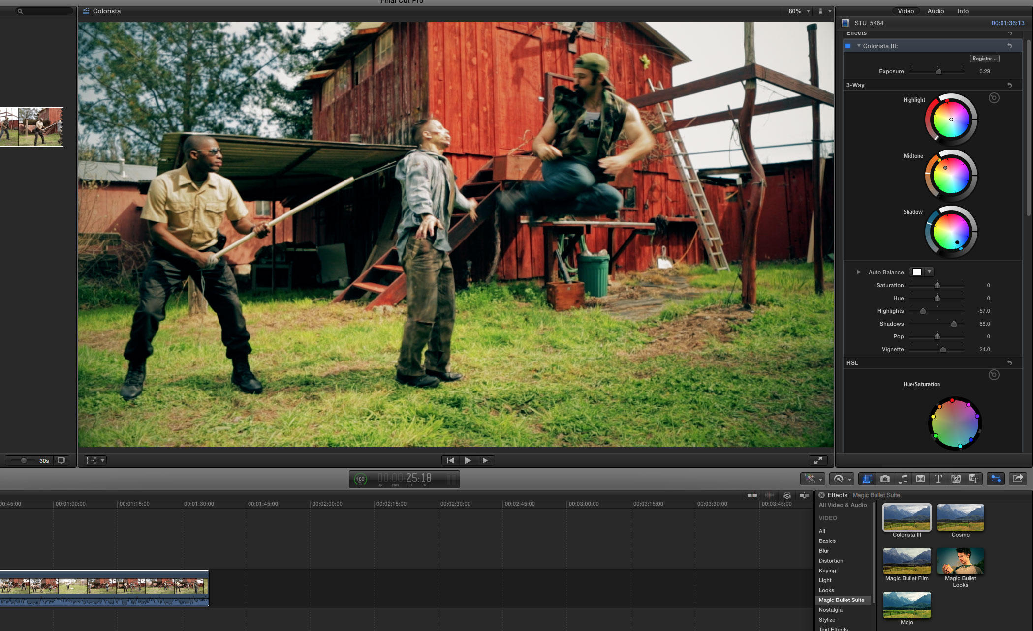
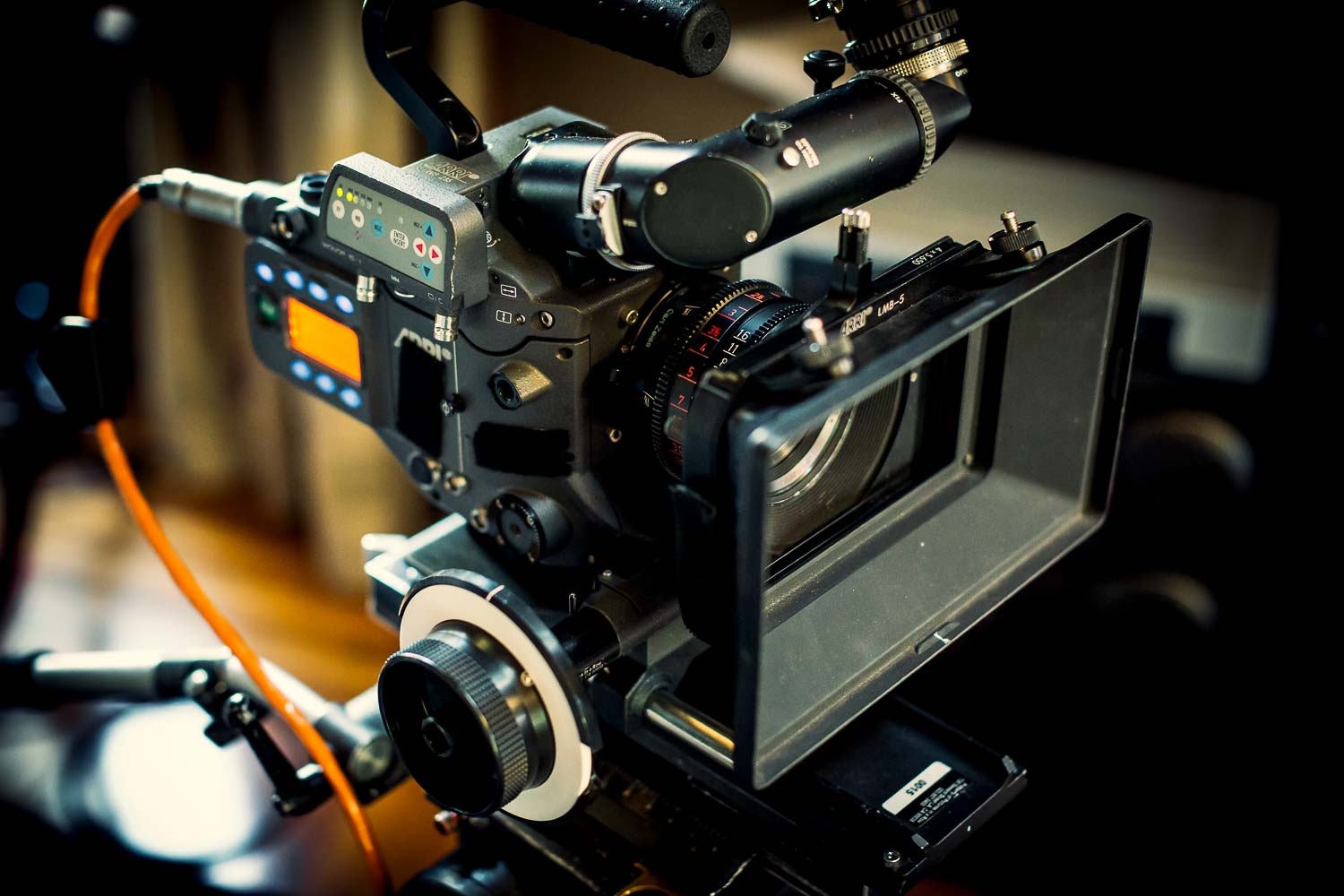
We completely redesigned the interface for Magic Bullet Looks 3.0, and I personally created 198 all-new presets, built with brand new tools like the Colorista Tool, the 4-Way Color Corrector, and the powerful Shadows/Highlights tool. These new presets reflect modern film sensibilities and techniques, and look great on footage from any camera, thanks to a new Color Space tool.
As always, Looks is a place where you choose and design the overall look of your project or scene. It works great on an Adjustment Layer, stretched across several shots. It’s color correction plus a lot more, like diffusion, flares, vignettes, and simulations of real camera phenomena, like distortion, chromatic aberration, and real, measured film stocks.
With Looks, our goal is to get you close to the finish line with a preset, but also to inspire you to make the look your own. We've made numerous small workflow changes to make that easier than ever before.
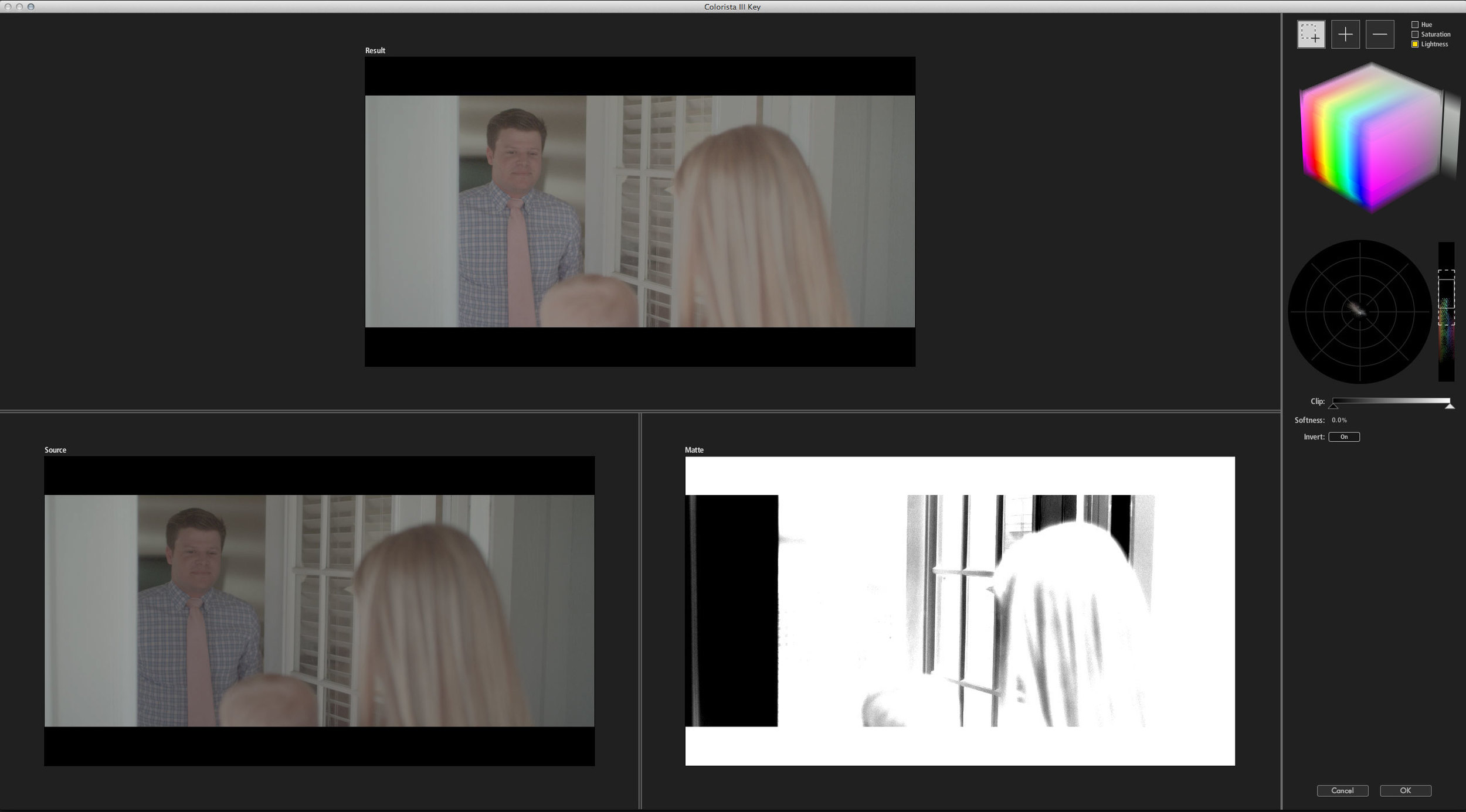
Colorista III is simpler, more powerful, and more integrated into your editing process than ever. We dropped our custom Power Mask features, because Colorista works so brilliantly with the masking features built right in to your editor. We kept the same powerful but easy-to-understand keyer, and added powerful Shadows and Highlights controls, individual point editing for Curves, and a how-did-I-ever-live-without-this Vignette slider. We also (finally) added support for Final Cut X!
Now you can do multi-layer color grading with powerful keying and multiple tracked masks, right inside your editing software. And the results play back in real time on most consumer hardware.
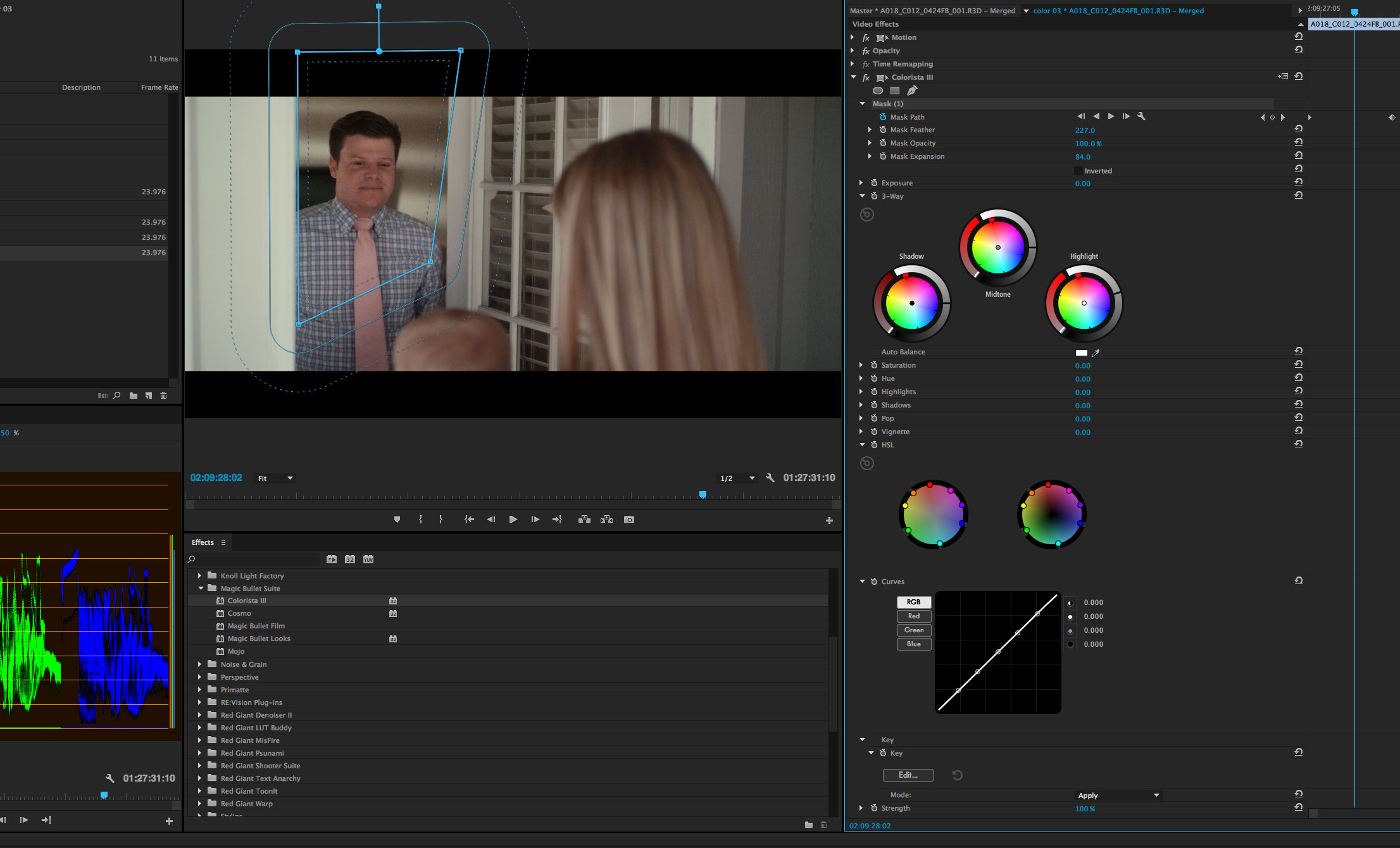
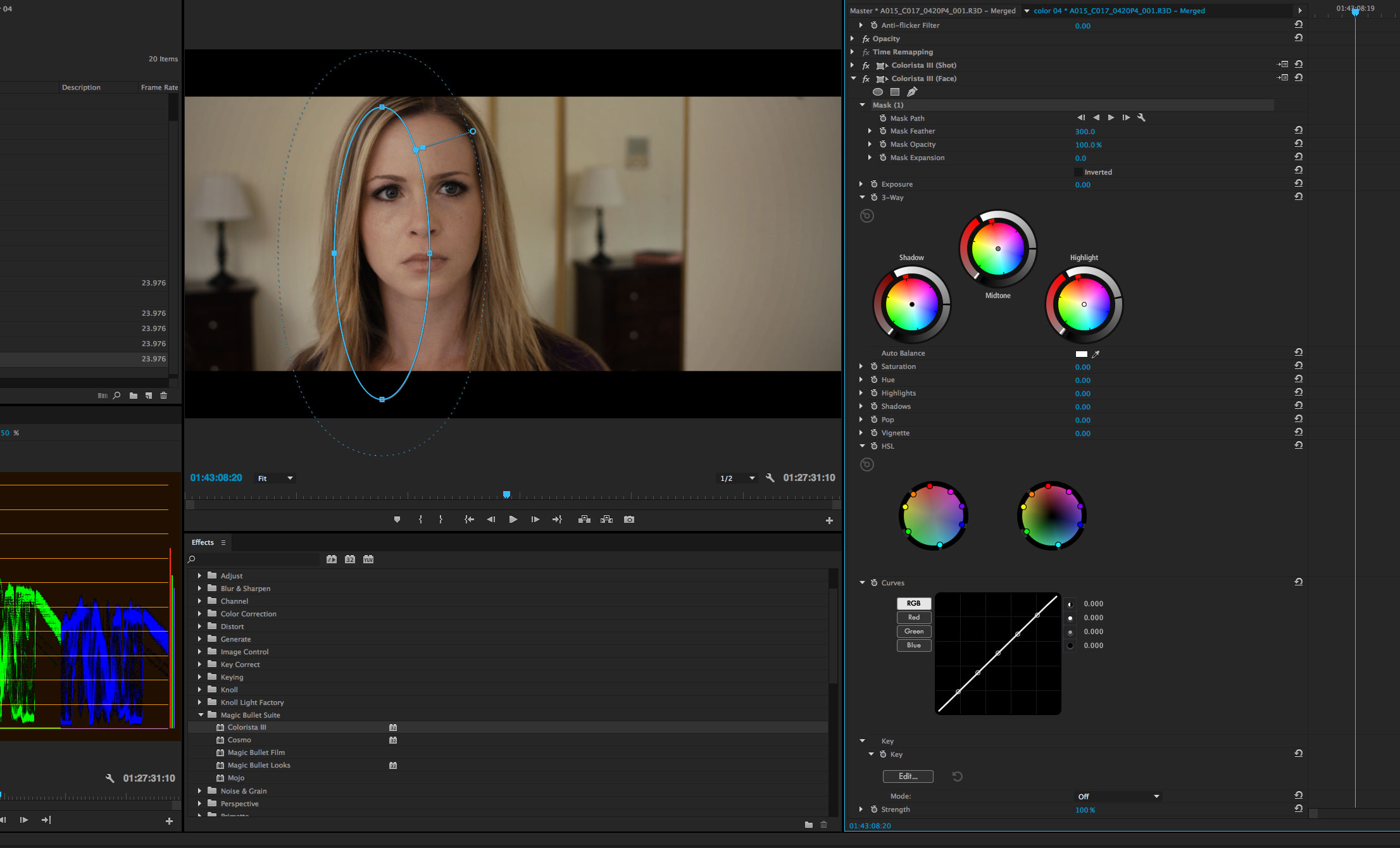
If this sounds like a big deal to you, I agree. I just colored an entire 5K Red Epic feature with a beta version of Colorista III, and the process was simply amazing. The film was edited in Premiere, and when it came time to start the color work, we spent not a single moment conforming or converting, but just dove right into our grading, not worrying for a second about repos, speed changes, warp-stabilized clips, or transitions.
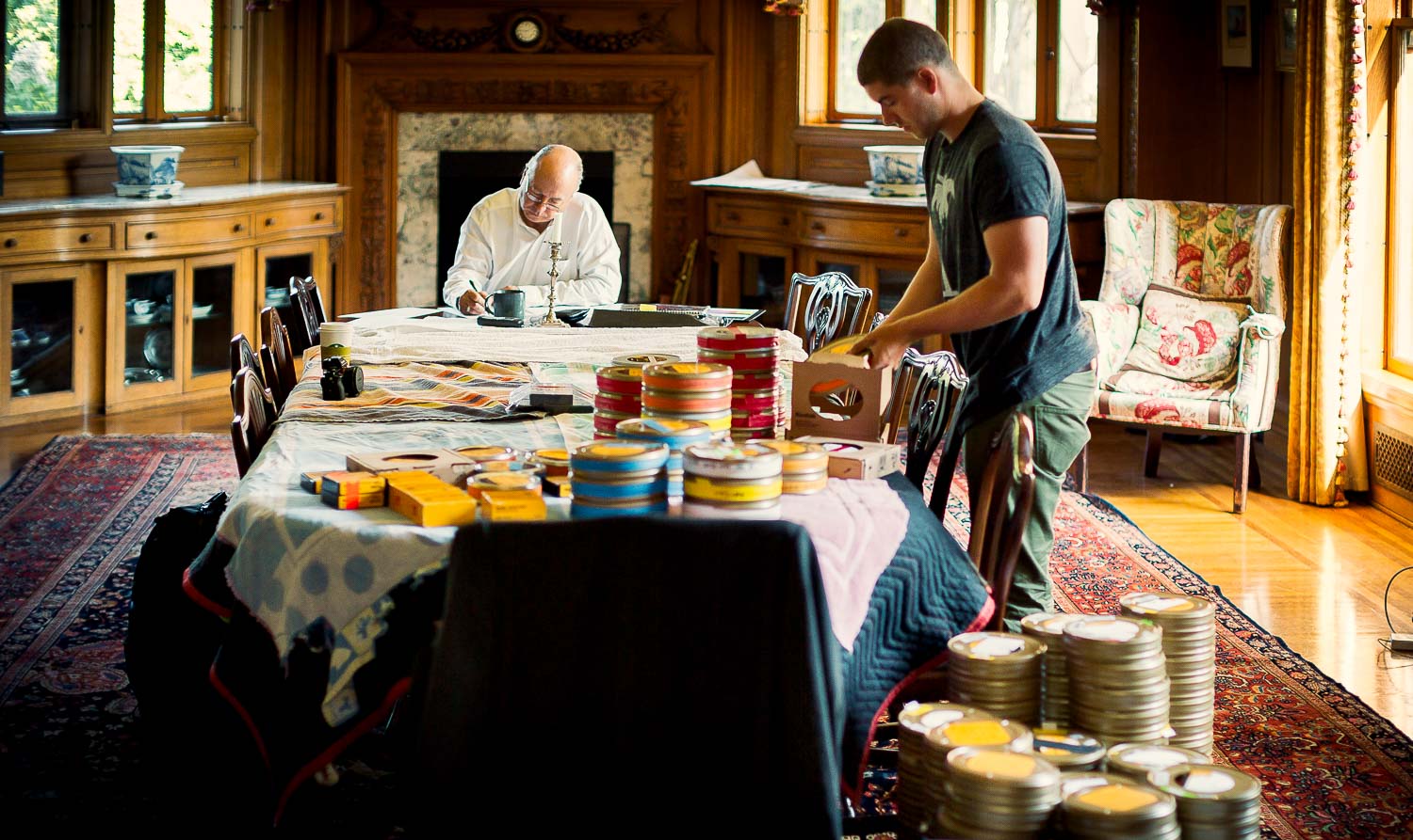
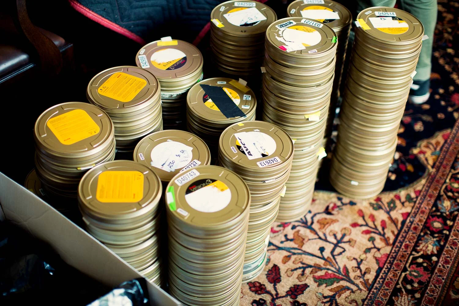
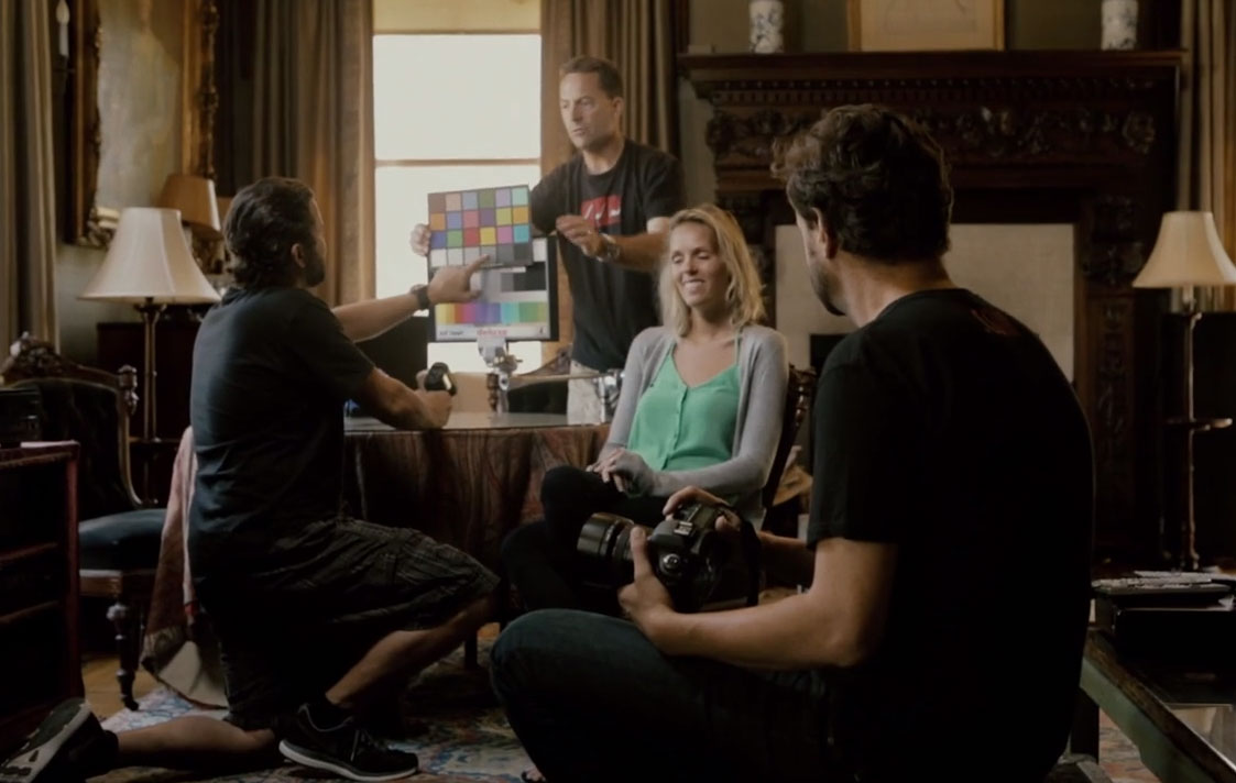
I spent a day with cinematographer and director Peter Lang and his amazing crew, shooting over hundred variations of film stock, processing, and developing techniques (along with Canon, Sony, and Arri digital cameras). We scanned an analyzed the results and used them to create Magic Bullet Film, which not only gives your digital video the look of real celluloid, it simulates the entire photochemical process.
Use the Film Neg and Film Print tools inside Magic Bullet Looks, or just apply the standalone Magic Bullet Film effect to your shots for a quick, but customizable, cinematic look.

The entire Suite of tools, including Mojo, Cosmo, and Denoiser, has been optimized for your GPU, making most effects real time on modern systems. On my three-year-old iMac, even the most complex Looks presets play back in real time in Premiere, as does an HD clip with three or more instances of Colorista III applied.
To celebrate the release of Magic Bullet Film, filmmaker Seth Worley created another amazing short. Hit that full-screen button and enjoy.
Don’t forget to check out the behind-the-scenes of Old/New. with a look at how we created Magic Bullet Film, which Seth used to grade the short.
The filmmakers I know like to start working with color as soon as they begin editing. Whether they are working for a client, or on a personal project, they are often tweaking the cut, and the color, right up until the very last export. They don’t have teams of assistants to conform cuts for them or manage media exports, but they take full advantage of their suite of powerful tools, using everything from Warp Stabilizer to Dynamic Link.
And yet they expect—and deserve—that color correction can be as easy as Instagram, but as powerful as a session with an A-list colorist. They want powerful, creative color correction that operates in real time, right where they do their creative work.
This is why we made Magic Bullet Suite 12.
Slugline 1.1.0 is now available on the Mac App Store.
Yes, it's been a while since our last update. We've been busy working on some very cool long-term projects, including some exciting new features for Slugline, but this update fixes a couple of nasty bugs that we just recently cracked.
You can read the full list of new fixes and features on the Slugline Blog.
If you have yet to try Slugline, here's a brief tutorial showing how simple it can be to write a screenplay in an app with no buttons:
Two years ago, I was the very first presenter at the Bay Area Lightroom User Group. Tuesday, January 27, I'm returning to Adobe's San Francisco offices, Iron Chef style! Adobe's Benjamin Warde explains:
Here's how it will work: anyone who wishes may submit a photo ahead of time (details below). I will collect the photos - Stu will not see any of the photos until he's standing up in front of us all at the user group meeting.
Then, having just seen the photos for the very first time, he'll flex his Develop module skills by making each of them look as awesome as possible, as quickly as possible. Depending on how many photos we get we may also impose a per-photo time limit on Stu.
(Ben gets to write stuff like that about me because we've known each other since Kindergarten.)
See the complete details here. Please only submit an image if you plan on attending. And please do attend! I might include a sneak peek at some future Prolost Lightroom presets.
A few years ago, I started a long-form writing project. Some might call it a “book,” but “books” need to get finished, and this, clearly, was not such a project — otherwise you’d have heard of it.
I began the project in Scrivener, an app with a devoted following of which I was a member. Incredibly powerful, and with a multi-document, structured approach designed specifically for book writing, it seemed the perfect choice.
Scrivener saves its own file format, called .scriv, which is essentially a folder full of files. The text itself is stored in multiple RTF files, which is an open format, but the writer never sees these files, and the glue that binds them together is understood only by Scrivener.
Back in 2011, iOS writing apps couldn’t work with RTF, so if you wanted to write on your iPhone or iPad, you need to use plain text. The lovely folks who make Scrivener knew that we wanted to edit our “long-form writing projects” (sticking with that) on the go, so they created what I’ve come to realize is the customary Scrivener solution to the problem: A huge amount of clever engineering, and an inscrutable, tutorial-requiring user interface for automatically dumping your work to text files each time you close the project. These text files are examined every time the project is opened, and any changes are synced into the project. Only the differences are edited in, so any non-plain-text-compatible formatting, such as italics and headings, remains unclobbered—as long as it isn’t in the paragraph you edited remotely.
I did this for a while, but you’ll never guess what happened. I started clobbering a lot of italics. Every time I opened Scrivener, I would compulsively examine all the synced-in changes, and recreate any special formatting that had been lost. It was distracting and counterproductive. I was working to support the system, instead of the other way around.
I became so frustrated with this that I decided to abandon the robust support structure of Scrivener, and try a sip of the Apple Kool-Aid. I had iWork on my iPad and my Mac, so I moved my document to Pages. This process kept me busy with formatting fixes, but eventually I had all my words in one .pages file. In early 2011 there was no iCloud document syncing, but I imagined I’d be OK with emailing the document back and forth to myself. In 2011.
I immediately experienced problems. First, Pages is a bizarre experience on iOS. As a WYSIWYG app, it must show you the correct fonts and paragraph widths. This means that your text cannot be displayed in a typeface and size optimized for a smaller device, which makes for an awkward user experience involving awful things like side-scrolling.
Then I began to notice problems with the writing I’d been doing on the iPad. On the Mac, Pages would automatically convert my straight quotes to curly as I typed. The iPad version did not do this. As you can imagine, this meant that I’d obsessively correct the iPad quotes to curly, manually, every time I opened the file on the Mac. Because writing.
Worse still, iOS would convert my document to a variation of the Pages format suffixed .pages-tef. These files broke some things from regular .pages files. If you like horror stories, you can read all about these conflicts here and here.
At this point I decided that writing a long-form project might not be for me. I’m not kidding.
In February 2010, Scrivener’s Keith Blount wrote 8,100 words about why they wouldn’t be creating an iPad version.
Scaling Scrivener down... would be a massive feat in itself. It may sound simple – just do less! But it doesn’t work like that. And would a scaled-down version of Scrivener even be Scrivener?
But in December 2011, he announced that they would be creating Scrivener for iPad, and even showed a screenshot. Some bumps in the road later, they began to reveal that Scrivener for iPad wouldn’t be scaled-down much at all.
The most recent update on their blog indicates that they hope to release Scrivener for iPad sometime in 2015.
I don’t mean to pick on Scrivener. In fact, I am beyond grateful to Keith for being so open with his team’s trials and tribulations. I certainly learned a lot from his experiences. The most cautionary part of it all for me was that Keith felt that a stripped-down version of Scrivener would not fly with his users, on any platform. It seemed to me that his own answer to the question he posed in 2010 was: no, a scaled-down version of Scrivener would not be Scrivener.
In the screenwriting world, Final Draft seemed to make the same decision. After exhaustively poling their users about what they’d be willing to give up in a mobile version of their controversial app, the results came back decisively: we want it all. In my review, I called the result “10 pounds of app in a 1.5-pound bag.” I’ve never used it since.
Who would have thought that simple words on a page would be so painful to move from platform to platform, app to app, device to device? Proprietary file formats are inherently complex. Just read poor Keith’s description of how hard it is to safely sync a Scrivener file between Mac and iOS. Or John August’s hoop-jumping to rescue old Final Draft files.
Apple is never one to be held prisoner, even by their own past. Their solution to break free of the Mac/iOS syncing problems they created for themselves with iWork was to dumb down the capabilities of the Mac apps to match those of the iOS versions, and break compatibility with older files.
Proprietary file formats make writing suck.
Recently, I dusted off that Pages file and exported it as plain text. I pasted that into smaller .txt files, one for each Chapter. These files were actually created for me by Leanpub, a service that publishes long-form... oh, hell, it publishes books. It’s also free to use however you like, even without using its publishing service. It has an online engine that converts plain-text to popular eBook formats like .epub and .mobi, and the syntax you use for things like italics and links is, of course, Markdown.
These Markdown files can be edited anywhere, on any device. You’ll never corrupt or break them. They are future-proof, and infinitely portable. And they sync like butter.
Although I remain a huge fan of Byword for plain text writing on Mac, it does emphasize a single-document model. Other apps exist that strive to bring that scrivener-like multi-document navigation to plain text. My first thought was to try Ulysses III for this, but its document handling model confused me and added extra characters to my files, breaking the Leanpub export process.
Then I remembered Write. It allows you to add a folder to its left-hand sidebar, and then navigate the contents. Unlike Ulysses, it doesn’t try to hide the plain text experience from you. It’s perfect for my needs, and it’s $10.
But my point here is not that Write for Mac is the perfect writing tool. My point is that the agnostic nature of text files allowed me to find the perfect writing tool for me, for this project, today. In the future, Write may be no more, but another app will take its place, and I won't have to reformat a thing.
I have a screenwriter friend who graciously turned down my offer of a free copy of Slugline.
He’s perfectly happy in Final Draft. He knows it’s not great, but that doesn’t bother him. He’s “not very technical.” Slugline solves two problems he doesn’t have: he’s not prone to distraction, and he’s not overly annoyed by Final Draft.
Until last week, that is, when he spent an entire day troubleshooting a corrupted Final Draft file.
When we launched Slugline, I wrote a blog post there called The Right Amount of Simple. The basic idea is that WYSIWYG writing apps present a simple facade that requires a surprisingly complex back end — and that complexity can bite you in numerous ways, adding cognitive load at best, and at worst, suddenly creating a user experience so complex that it can actually stop you from working.
Maybe it’s a new version of your favorite writing app that won’t open your six-year-old files. Maybe it’s a years-long delay in a compatible mobile app. Maybe it’s a corrupted file.
What I’ve observed is that “not very technical” people wind up going through incredibly technical contortions to protect the illusion of simplicity feigned by WYSIWYG writing apps. Just ask my buddy about peeling his writings out of a malformed XML dump.
Now that my long-form writing project is in simple, plain text files that I can edit anywhere, I once again feel joy every time I open it.
Maybe I’ll even finish it one of these days.