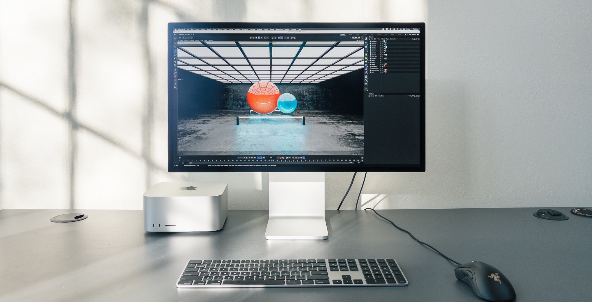
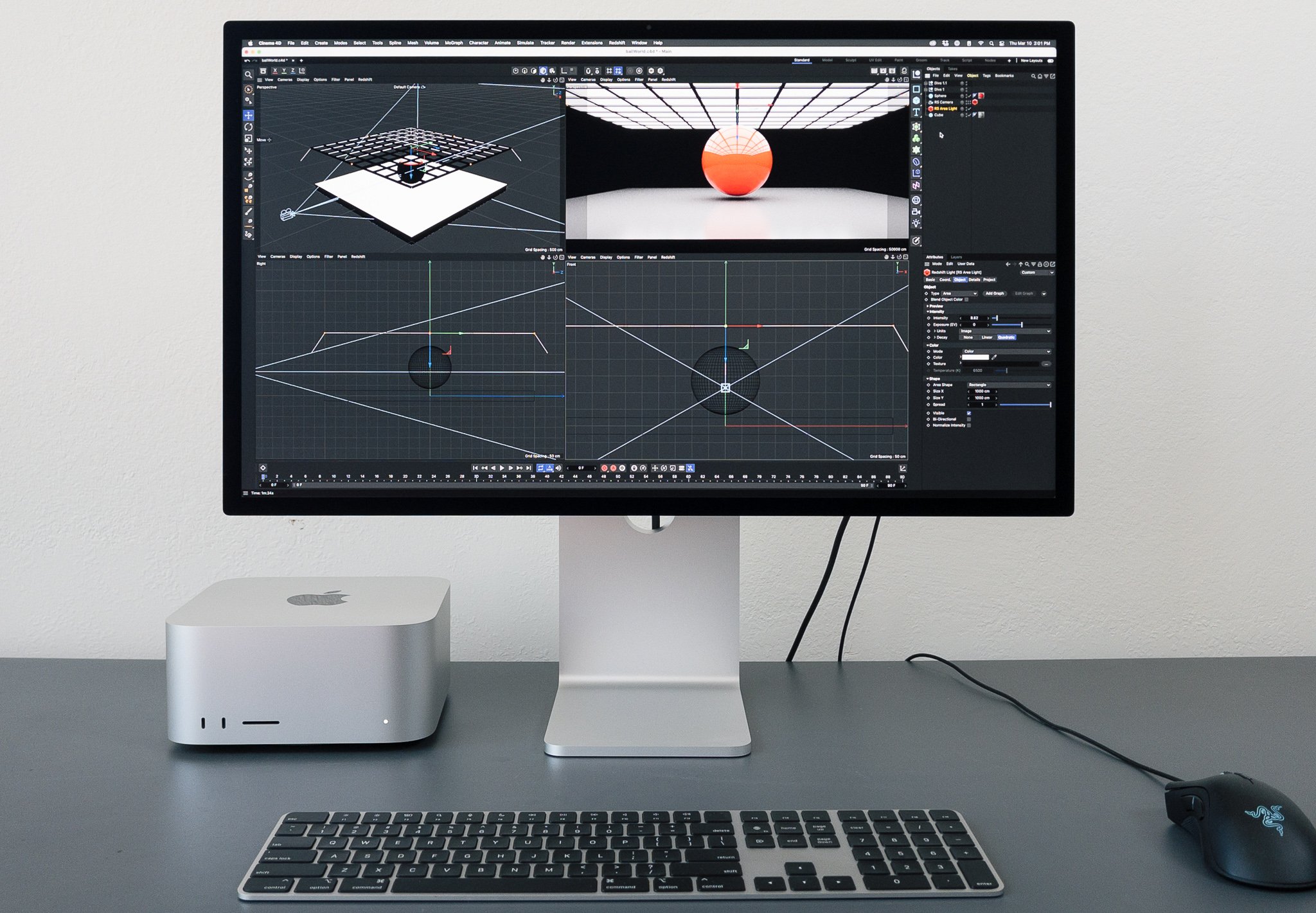
In October of 2021 I got to test a 14″ MacBook Pro with M1 Max processor. It performed so well, that I, along with many Mac power-users, questioned whether it could replace my desktop Mac.
Last week, I reported that the answer turned out to be no:
What makes a computer powerful, for my workflow, is not just processing power. It's connectedness, and presence. It’s speakers and microphones and ingesting CFAST while rapidly recalling raw files from fifteen years ago. It’s the power of side-by side displays that remind me in the morning of what I was working on the previous day, because nothing has moved and a dozen apps are still running. It’s desk space and disk space, and most importantly, head space.
I love having a separate desktop and laptop. My ideal laptop should be nimble, freeing my desktop to be a workstation, intractably entangled in a jumble of peripherals.
My desktops of choice for many years now have been highly-specced iMacs, culminating with Apple’s one-hit-wonder iMac Pro, which I spent Mac Pro money on and considered to be the ideal computer for my needs.
Until the very day after I wrote the above, when Apple announced the Mac Studio.
Split Personality
As an iMac fan I never saw any downsides to the all-in-one design. From 2009 to 2017, with each new iMac I bought, everything got better; processors, drive speed, displays. Upgrading all of them at once in a reliable, preconfigured package perfectly met my needs as a power user, not computer-tinkerer.
I was hoping that Apple would put the power of the M1 Max in a big iMac. But I was concerned that the direction they went with the iMac 24″, which is thinner than the original iPhone, would challenge two of the features I love most about my iMac Pro: its quiet cooling and plethora of professional ports.
For Apple to address this, they would have to do two things they’ve been steadfastly avoiding: build a mini-Mac Pro (or a big Mac Mini?) and release a standalone display for mortal humans. Not only was I unconvinced Apple would do this, I was skeptical I would prefer the result to the convenience of a pro-grade iMac.
So I watched the March 8th event with cautious hope, but little optimism.
Mac Stu(dio)
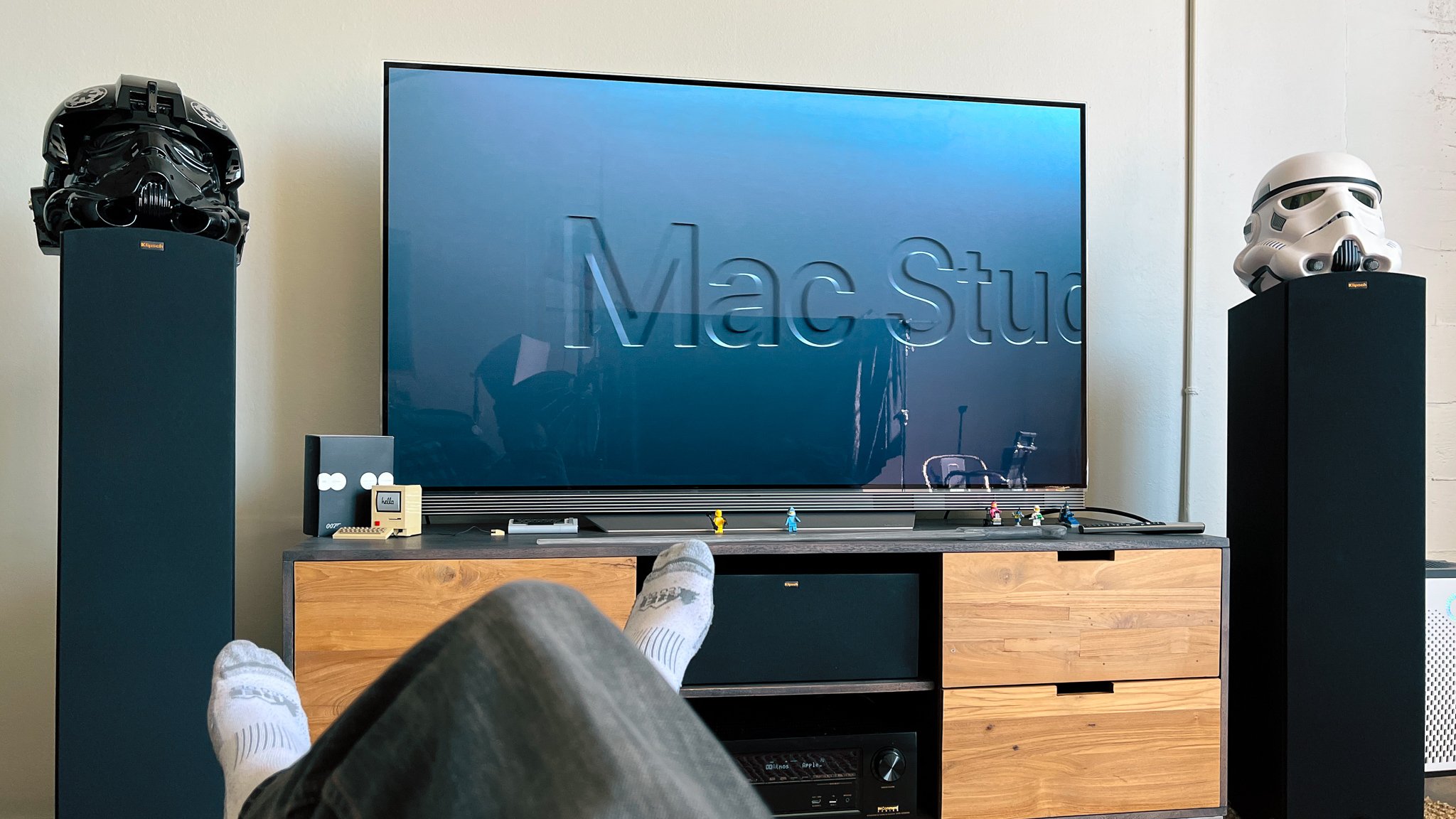
POV: You are Stu in his studio watching the reveal of the Mac Studio.
Spoiler alert: Apple nailed it.
Before revealing what kind of container it would be in, Apple talked at length about “one last chip” in the M1, M1 Pro, and M1 Max lineup: the M1 Ultra. Simply put, it’s two M1 Maxes “fused” together, which means it is configurable to double every one of the M1 Max specs, but is still seen by the OS as one multi-core CPU, and a single GPU.
The M1 Max runs cool, but will heat up and potentially even thermally throttle in the 14″ MacBook Pro. Two of them together didn’t feel like something that could fit in a paper-thin all-in-one, even with a power cord and a fan.
And then Apple revealed the Mac Studio. Milled from a solid block of aluminum, this mini Mac Pro — or is it a big Mac Mini? — is exactly what I said I didn’t want, and the minute I saw it, I knew I’d been wrong.
🫤
Especially when Apple revealed the exact display I’ve been begging them to make. The Studio Display is essentially the same 27″ non-HDR panel found in the 5K iMac, but with a Center Stage camera, barely-there bezels, and aluminum trappings.
It had been convenient to upgrade both my display and computer with each new iMac, but there are downsides to using a consumer computer for pro work. It’s not fun to add or remove peripherals from a tall display, and it’s scary sometimes to know that when you tilt your monitor by a few degrees (or elevate your standing desk), you’re yanking on a dozen or more cables. I immediately saw how decoupling the display from the computer could create a better experience for me — one that I simply wasn’t open to in the form of a 40-pound behemoth rolling around on $400 wheels, enclosing airspace I would never fill with PCI cards I would never buy.
Profiles in Courage
I tested a maxed-out Mac Studio with M1 Ultra, 64-Core CPU, 128GB of integrated memory, and 8TB SSD. This time I was prepared, with Maxon’s benchamrk tool for the Redshift GPU-based 3D render engine, and the same render-intensive After Effects project I had just profiled on the M1 Max laptop.
While the Mac Studio is configurable with an M1 Max, the M1 Ultra version should be the fastest Mac ever made, containing two complete M1 Max chips. I was curious how close it might come to being twice as fast as the M1 Max MacBook Pro.
Redshift Benchmark
The M1 Ultra rendered the Redshift Benchmark in six minutes, ten seconds. That’s not quite twice as fast as the 11:08 from the M1 Max, but significantly faster.
Second to render Redshift Benchmark. Shorter bars are better.
In testing my own scenes, with render quality cranked up to unnecessarily high levels (I am me, after all), I got a similar proportion of results.
Seconds to render a super cool Redshift scene incompetently set up by me. Shorter bars are better.
The trajectory of Apple’s integrated GPU performance is fascinating to me. On one hand, this is a grahics card-without-a-card with up to 128 GB of VRAM, performing at levels never before seen on a Mac. On the other hand, it’s still outpaced by a high-end gaming laptop that unabashedly spins up loud fans and draws a power like a Marvel villain. Will Apple’s GPUs have terabytes of RAM by the time they outperform an NVIDIA card?
In practice, working with Redshift is way more fun on the big display and cool-to-the-touch keyboard of the Mac Studio. There's less “road feel” than with a laptop — you just push on it as hard as you can, blissfully unaware of how hard it’s working. You would not say that about working on the Razer gaming laptop.
After Effects Beta
Where Activity Monitor shows Redshift pegging the M1 Ultra’s integrated GPU to 100% for the duration of a Cinema 4D batch render, After Effects, even with M1-optimized multiprocessing in public beta, does not do the same for the 20-core CPU. Compositing is more i/o bound than ray-tracing, but this project uses very little media, and the SSD of the Mac Studio is faster than some RAM, so the issue is really that my chosen project uses a part of After Effects that is notoriously not modern: the 2.5D renderer introduced in, and not substantially updated since, 2001.
My little spaceships rendered faster on the Studio, but we’ve hit the point of diminishing returns.
Circle of Stone spaceship pass only, rendering in Adobe After Effects. Shorter bars are better. iMac Pro as tested: 3 GHz 10-Core Intel Xeon W, 128 GB 2666 MHz DDR4, Radeon Pro Vega 64 16 GB.
Double, or Trouble?
In my limited testing, with these highly-specific tasks, the M1 Ultra is handily faster than an M1 Max, but not doubly so. There’s a soft shoulder to the performance envelope of the M1 line. I plan on running some more tests of course, but my sense is that those of us who make the creative tools that can truly take advantage of the M1 Ultra’s power still have work to do to occupy every corner of performance possible.
After Effects beta rendering about seven frames at once of my benchmark project. CPU to spare.
Cool it Now
I didn’t just render a few benchmarks on the M1 Ultra, I did my best to keep the little Alumilump rendering 24 hours a day. The design of this big little box is half fan, and I wanted to see and hear it pushed to its limits.
Frickin’ lasers.
On the rare occasions that I could do that to my iMac Pro, that quiet cooling would become audible, and a stream of hot air would flow from the back. After an all-night Redshift render, the 14″ MacBook Pro with M1 Max would also get loud enough to call attention to itself in a quiet room, and I recorded the temperature of the housing at 100.8º F (38.2º C). This is hot enough to be uncomfortable, but nothing compared to some Intel MacBook Pros I’ve owned over the years, one of which would burn my fingertips routinely even when placed on an active cooling stand. There's a spot on the top of my 16″ MacBook Pro (2019, 2.4 GHz 8-core i9) that gets that hot when the machine is essentially idle.
After letting the Mac Studio with M1 Ultra render hundreds of frames with its 64-core GPU pegged the entire time, I placed my hand behind the box and felt the slightest waft of warm-ish air gently emitting. If I pressed my ear to it, I could just barely hear the fans over the other sounds in my studio.
This is why this thing is not built in to the back of a display. It’s a quiet, cool beast with ludicrous specs.
It’s a workstation.
After 20 straight hours of maxed-out GPU rendering, a wee puff of warm air.
Many Ports in a Storm
It’s a workstation because it never breaks a sweat, but it’s also a workstation because it is bristling with ports. The SSD card slot is on the front, for human use. There are two USB-C ports right next to it (Thunderbolt 4 on the M1 Ultra). You know. for stuff.
Surely you ingest.
There are four Thunderbolt 4 ports on the back, alongside 10-gig ethernet and HDMI. All welcome, but the real joy is from the two USB-A ports. I filled them up fast and still had to resort to some adapters, but I’ll be able to swap this one-for-one with my iMac pro and not miss a Loupedeck or a Streamdeck.
Display’s the Thing
The Studio Display lacks true HDR and 120Hz ProMotion, two things almost no one will miss. But for only $300 more than the LG 5K UltraFine Apple had been suggesting one might use with a Mac Mini or MacBook Pro, you get a factory-calibrated display with a beautiful aluminum housing and stand. Strangely, this display also contains a better processor than Apple shipped in the Dev Kit Mac Mini (or currently supplies in an Apple TV), presumably to run that Center Stage camera.
As you should expect from Apple, the Studio Display has great P3 wide-gamut color accuracy out of the box. In my testing, it doesn’t seem to exhibit the mild and temporary burn-in that I sometimes notice on my iMac Pro. It’s a very good display, and should be viewed as the essential mate to the Mac Studio, although it will be popular with anyone looking to dock a MacBook Pro as well.
Center Stage
Center Stage is Apple’s term for a front-facing camera that pans and zooms to frame people. This works by starting with an ultra-wide camera, and using facial recognition to drive a crop. Simple enough, except that doing just that would look terrible. No one loves how they look on the edges of a fisheye lens.
Apple is doing it the hard way, like they did on the 12.9″ iPad Pro; they are accurately removing the lens distortion and vignetting from the ultra-wide image, then panning and zooming across that rectilinear result with a virtual 3D camera. You can see perspective lines change as if the camera was physically panning. We learn to do this kind of photographically-accurate reframing in visual effects, and typically don’t expect commodity hardware to do it in real time for chats with grandma. Unless it’s Apple.
Of course, since you’re looking at a crop of a heavily-processed image, resolution and clarity are what Apple trades for panning and tilting, and you can sure tell. On a portable iPad this makes sense. On a desktop that one typically sits calmly in front of, you might wish you could trade Center Stage for a static, high-quality camera.
Update: Many other reviewers have noticed the suspiciously low quality of the camera, and Apple has stated that there’s a software issue at fault and a fix coming.
We Don’t Talk about Nano
If Mork had an iPhone would he be a Nanu-texter?
When I finally caved and bought a Pro Display XDR, I did not opt for the Nano-texture surface option, a $1,000 add-on designed to cut down on glare. I was already accustomed to positioning my desk to avoid reflections in my brightly-lit studio because of the reflective iMac Pro screen.
In 3D rendering we talk about surfaces being “energy conserving.” This is a fancy way of saying that no more light can bounce off a surface than hit it in the first place, and that light can be either specular (like a mirror reflection), or diffuse (like paper), or somewhere in-between — but where it reflects specularly, it cannot reflect diffusely, and vice-versa.
This is why, while you can’t see my reflection in the photo above, you can see a slight hint of a shadow on the screen from my window frames. Only diffuse ilumination registers shadows (you can’t cast a shadow on a mirror). Apple has traded specular reflection for diffuse.
If you could have a slider to blend between Nano and non-nano.
When Apple started shipping shiny laptop screens (as an option) in the 2000s, it was because of this trade-off: diffuse light washes out a display, where specular reflectivity improves contrast, as long as the reflections aren’t overpowering. When a display surface is highly specular, like my iMac Pro screen, manufacturers attempt to cut down on reflections by using anti-reflective coatings. No one had yet combined the idea of an anti-reflective optical coating with a matte display. But that’s exactly what Apple has done with the Nano-texture Glass.
Testing the Studio Display with Nano-texture Glass on sunny days in my studio, it seems to achieve the best of both sides of the trade-off. It absorbs the majority of the direct light that falls onto it, and what light it does bounce back, it scatters into unrecognizable (and slightly purple) diffuse reflections. It seems worth the comparatively-reasonable $300 surcharge if your environment is not well-controlled for light. Just beware that the Nano-texture surface is more difficult to preserve and clean than a standard shiny display.
Studio Display alongside a 4K iMac.
Out Standing
Apple’s new hardware is based on ARM.
Apple gotta Apple, and one place they did it with the Studio Display is the $400 option of a tilt- and height-adjustable stand. In my opinion, which is corroborated by ergonomics experts, Apple’s iMacs place the display too low on a surface that also supports the keyboard and mouse. I’ve always put my iMac on a riser, which is not only ergonomic, it’s also useful as a place to stash stuff or route cables.
The luxury of the premium stand is not in the extra height it provides (it actually looks kinda E.T.-awkward in tall mode), but rather in the experience of adjusting it. So if you share a computer with a person with different ergonomic preferences, and would therefore be manipulating the display often, it might be something to consider. Otherwise I’d suggest you stack your Mac on a rack.
HDR is the Future
My rendition of how an LED array backlights an HDR display.
I guess. But we don’t live in the future, we live in the present. Apple’s approach to High Dynamic Range display (from the Pro Display XDR down to the 12.9″ iPad Pro) is a miraculously good implementation of a flawed method: using zoned backlights that are significantly less dense than the pixels of the display. I illustrated this process in my MacBook Pro post, but I didn’t go into detail about how and when you can see artifacts associated with it. Let’s put it this way, if you want to remain happy with your Apple HDR display, don’t seek out videos designed to show where it breaks.
But even with a true per-pixel HDR display, such as my OLED TV, I remain skeptical of the value of really bright stuff in movies and TV. I like the deep, rich black and color accuracy promised by HDR presentation, but the actual High part in HDR still leaves me with mixed feelings. I wrote about this back in 2017 and still feel mostly the same.
I was reminded of this when watching the season two finale of Ted Lasso on Apple TV+. Early in the episode, Sam (Toheeb Jimoh) is in the locker room looking at a piece of paper. Typically my family watches Ted Lasso on a Standard Dynamic Range (SDR) TV, but this time we were watching on my 12.9″ iPad Pro. I was shocked by the creative decision to render the overhead lighting in the locker room at what seemed to be the very maximum brightness supported by the display. It completely distracted from Jimoh’s beautiful performance. In fact, it simply made it hard to see, because my eyes had to adjust to the brightness of the background.

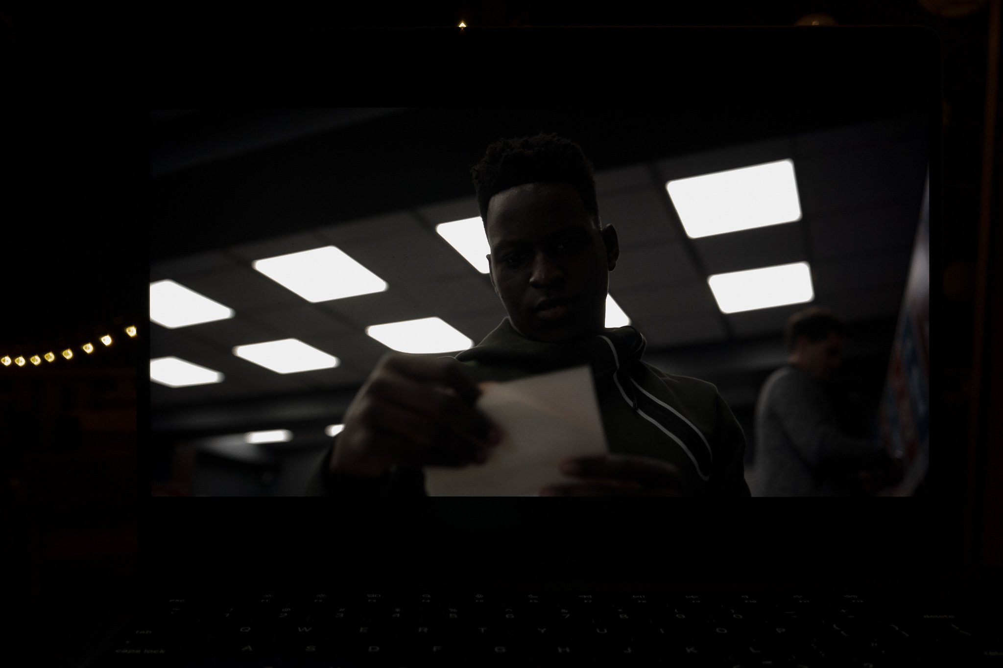
Let me try to capture this experience for you. Here’s the frame displayed in HDR on my 14″ MacBook Pro. It looks normal enough at exposure, but since the photo is not HDR, you can’t see how much brighter the ceiling lights are. But if I reduce the brightness of the photo by three whole stops, you can see what the true visual impression of this shot is: his face and the white of the paper he’s holding are at such wildly different brightness values than the background that the shot is hard to look at — like trying to talk to a friend when they’re sitting in front of a bright window.
This is such an odd creative choice (repeated throughout the series) that one might even suspect that Apple is pushing its show creators to grade for HDR effect, to show off their hardware’s capability. But HDR mastering does not require your backgrounds to overpower your actor’s faces. As I discovered when writing about this in 2017, Roger Deakins made damn sure this didn’t happen in Sicario, for example.
There are beautiful HDR experiences out there, such as Deakins’s own work on Blade Runner 2049. But it’s not an automatic win across the board. You shouldn’t be watching movies on your computer screen anyway, but you will view your own iPhone-shot photos and videos there, and those are likely to be HDR now as well. So, are you missing out tremendously to not have a High Dynamic Range computer monitor?
No, for two reasons:
First: for home movies, HDR is fun, but not essential.
And B: you get a little of it anyway, thanks to EDR.
EDR is Apple’s quietly cool tech for eeking HDR visuals out of an SDR display. And for you, dear reader, I have quantified exactly how much HDR your Studio Display’s EDR can muster.
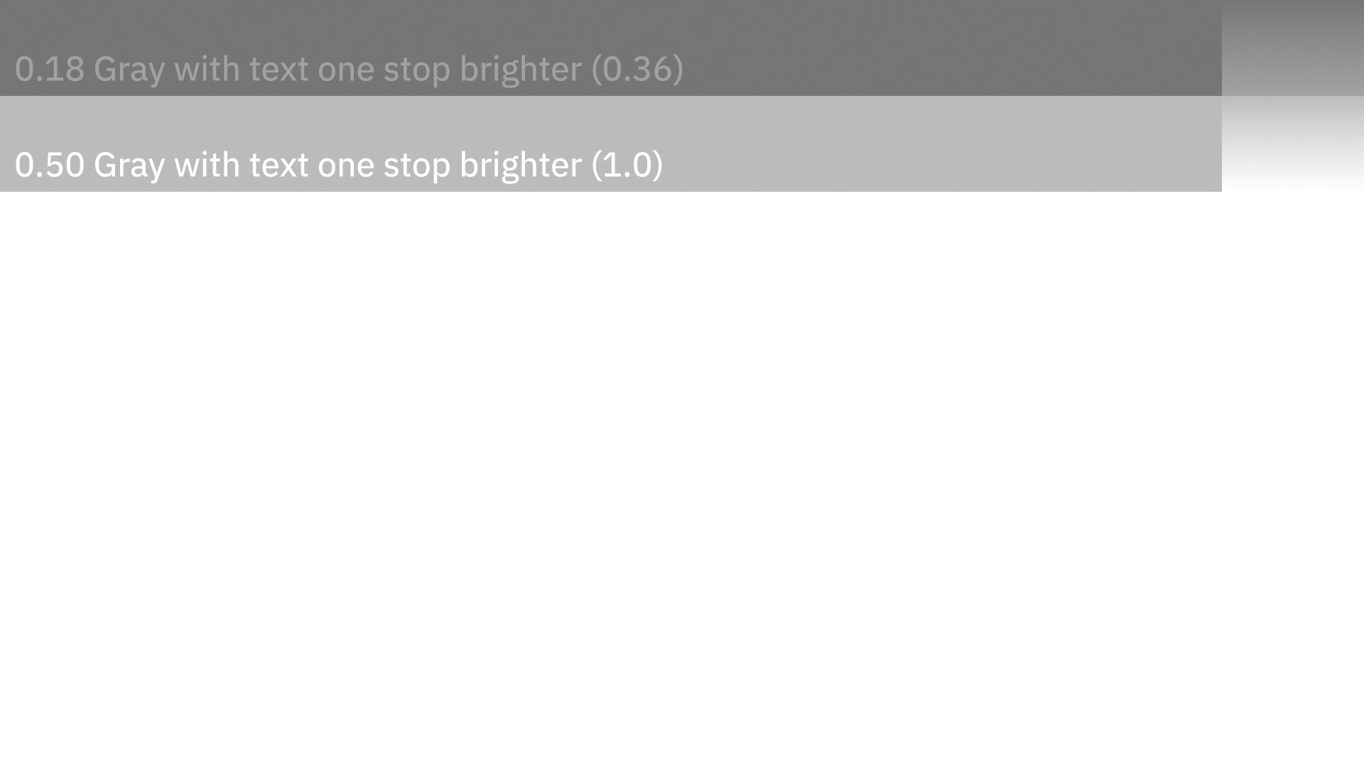
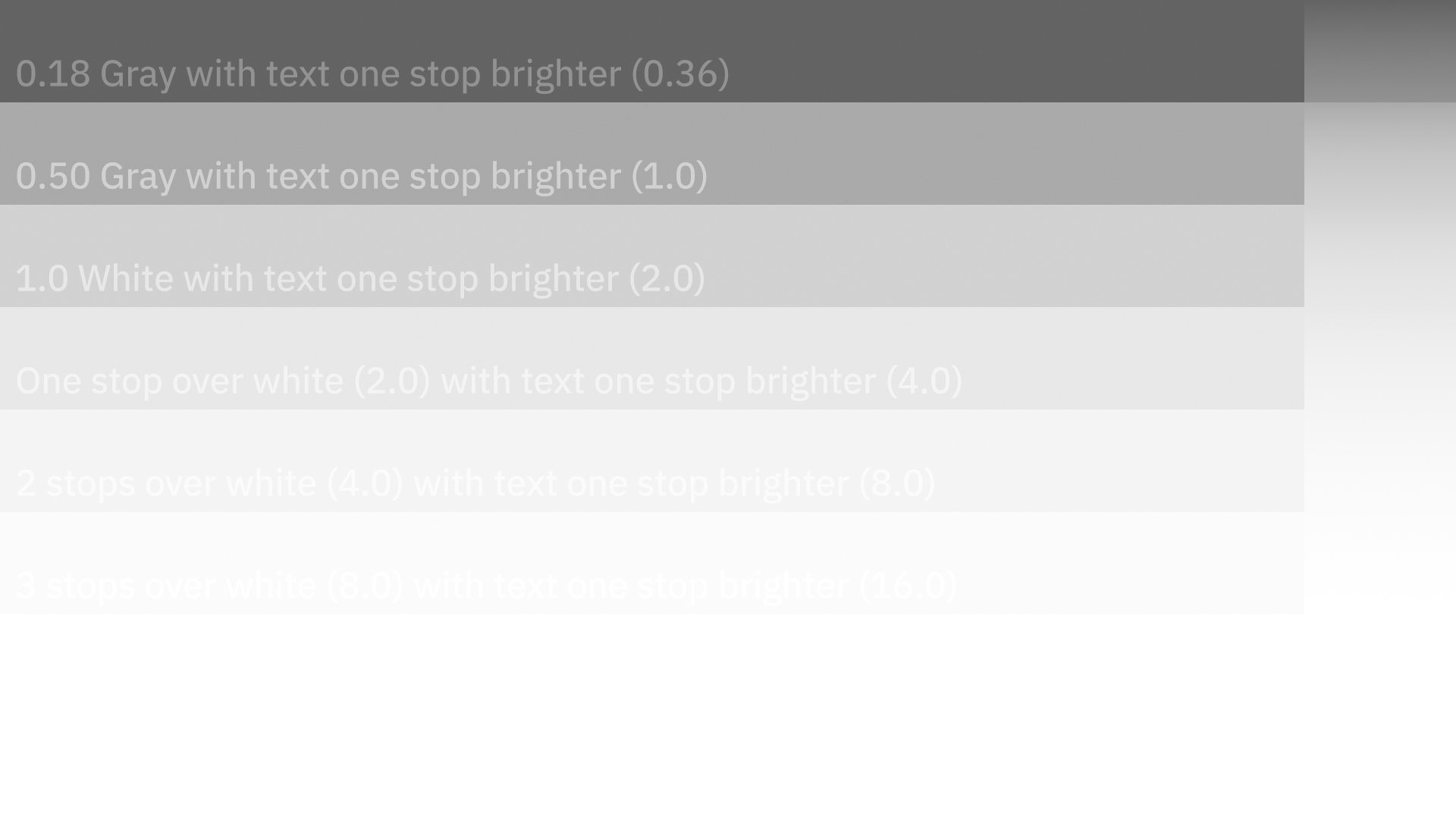
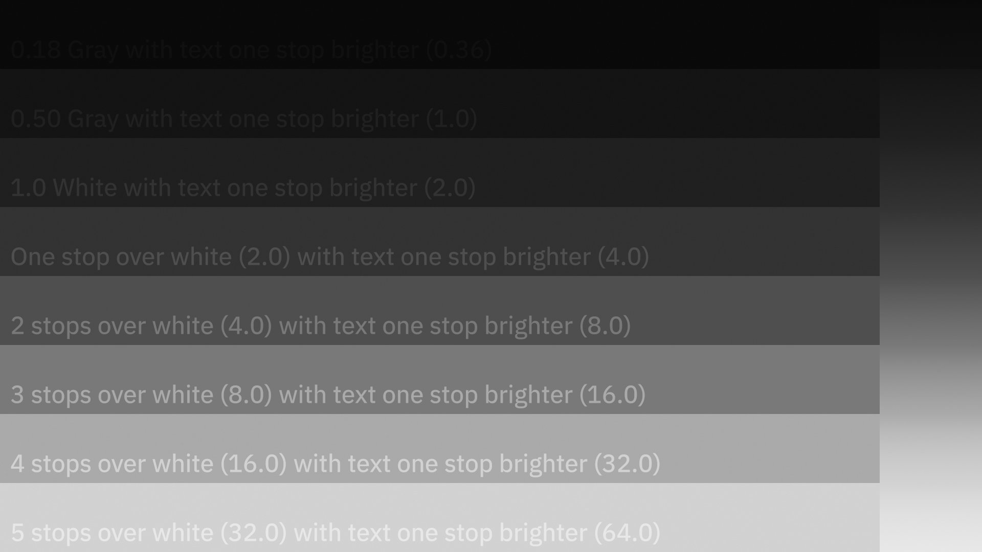
Consider this image. It’s an HDR test pattern I made that shows gray bars increasing in brightness, with text over each at exactly one stop hotter than the bar. I’m displaying it here as both a clipped-at-1.0 sRGB image, as well as an ACES Rec. 709 ODT version, the highlight-rolloff of which helps you see the otherwise-too-bright-for-SDR values. There’s also a five-stops-underexposed ACES version, just so you can read all the text. The bottom bar really is 32 times brighter than “white.”
The clipped sRGB version above is how the test pattern will appear on a pure SDR display. The white bar is the same pure white as the rest of the image, and you can’t read the text on it.
And that’s how it appears on the Studio Display:
WIth the brightness all the way up, the HDR text pattern clips at 1.0 white on the non-HDR Studio Display.
But only at maximum brightness. As soon as you reduce the screen brightness by even one tick, Apple’s EDR technology kicks in and uses the headroom to show you values brighter than white.
EDR reveals one extra stop of HDR highlight detail.
Hey, that’s HDR! Well, kinda. To be true HDR there are more requirements, such as deeper blacks than this uniformly-backlit display can muster (you'll only notice in a pitch-dark room). But it’s a little bit of HDR, and that’s just fine. And you get it without zoned backlight artifacts, or hey-where-did-my-$6,000-go artifacts.
Let’s take a look at what true HDR gets us on the Pro Display XDR:
HDR test pattern on Pro Display EXR.
Basically, one more stop of overbrights. A stop is a lot, twice as much light. But it’s also the bare minimum of extra range this chart can reveal. And hey, also notice that the image is not as uniform in color temperature as the Studio Display’s. The shadows are cool and the highlights are warm, where the visible range presents as neutral on the cheaper Studio display. And yes, you can plainly see that dark border around the edge of the Pro Display XDR in everyday use.
The Pro Display XDR and the HDR displays on the 2021 MacBook Pros and the 12.9″ iPad Pro are good, don’t get me wrong. But there are going to be people telling you you’re missing out on the HDR party with the Studio Display. I hope this little exploration gives you some perspective on whether or not you agree.
Enough Mac Prose
There’s so much more to say about the Mac Studio, let’s do a lightning round:
- Is the Mac Studio beautiful? No. Did Apple intentionally make it utilitarian in appearance to head off any form-over-function critiques that turned out to be tragically valid regarding the trashcan Mac Pro? Good question.
- Do I love the way this little Meatwad looks? Yes. I thought about hiding it in the cabinet alongside my RAIDs. but then I’d lose access to the front ports. It’s a functional object and it looks like one. It’s kind of, dare I say it, a truck.
- When I first set this thing up and just plugged my old-fashioned USB-A mouse into it without a second thought, I felt joy.
- If it’s weird that the Studio Display has a better computer in it than many computers, what’s even weirder is that the keyboard also has a computer in it, for handling Touch ID. Which is wonderful to finally have on my desktop.
- The Studio Display is not just a monitor with a camera. It’s a hub, with three USB-C ports and one Thunderbolt 3. It can also deliver enough power over USB to fast-charge a 16″ M1 Max MacBook Pro.
- The Studio Display has speakers! And they do a sort of sound-bar attempt at spatial audio. As with the speakers in Apple’s recent laptops, they sound better than they should for their size and orientation. Unlike with a laptop, Studio-ness demands real speakers, and there goes my second USB-A port to my DAC.
- These are handy.
Configuring a Mac Studio
With the MacBook Pro, I suggested that if you weren’t tempted by the maxed-out configuration, or accustomed to spending $4,000+ on a Mac laptop, then maybe you should consider the MacBook Air instead. This was a glib way of saying that the sweet spot for the pro-est laptop Apple’s made since the 17″ “lunch tray” MacBook Pro was at the pro-est end. Basically, don’t buy a 2WD Jeep.
I do not feel the same about the Mac Studio. The M1 Ultra version is extra in every way: It starts at double the base price of the M1 Max version. It weighs two pounds more, thanks to a copper heat sink. It is configurable to specs that your software almost assuredly cannot fully harness, and your wallet almost certainly will remember.
There’s a real range of viable options for configuring a Mac Studio. It starts great and goes to eleven. So here’s my buying advice:
First, the easy part: Everyone tempted by the Studio Display should go for it. It will be the perfect partner to a laptop or the Mac Studio. There’s nothing else you should get. As I’ve said before, if you’re the rare weirdo who should have ever bought a Pro Display XDR, you know it. Everyone else, here’s your perfect Mac display. If you have extra dough to spend, Nano over E.T.-mode.
As for the Mac Studio, it will be hard to gauge your needs for a computer this far ahead of what’s come before. But here are a few things to consider:
- The SSD upgrades are expensive, but this is your one shot at getting a massive amount of insanely-fast, Apple-warranteed drive space. If you edit big media files, stills or video, and are accustomed to working off a big external RAID like I am, you may want to consider upgrading the SSD and working locally for truly ludicrous multiple-streams-of-ProRes performance.
- As I mentioned above, the front ports are slower in the Max than in the Ultra.
- RAM upgrade? I’ve been living with 128 GB of RAM for years now. It was a luxury in 2017, and I can’t imagine going backwards. But RAM hits different in the M1 world, and might not be the be-all-end-all of lazy ADHD computing like it was in the Intel era.
- GPU upgrade? I bet you already know the answer to this one based on your workflow. This might be the exclusive domain of folks doing crazy computations on the GPU, like 3D rendering. That’s all. There is no other valid use of GPU compute. Stop ruining the planet.
The everything-maxed-out Mac Studio I tested retails for $7,999 USD. Add the display and that bumps to $10,298. Not cheap — also not more than I’ve ever spent on a Mac. But let’s look at another comparison:
If you back off on the display extras and the SSD, the price drops to significantly less than I spent on my iMac Pro four years ago. Everyone’s idea of reasonable is different, but Apple has the low end locked up with the M1 Mac Mini and MacBook Air, and now they have a steady progression into the extreme high end, with something for everyone along the way.
And truly, consider the comparisons above. Doubling the chip and the base price does not (yet) double your speed, espcially where the GPU is concerned. So the Ultra option really is for those kinds of pros who can turn every second of faster render times into money — but for whatever reasons haven’t extended that theory into a willingness to work on Windows.
More Mac Pros
Apple also said there’s a Mac Pro coming.
I’m not sure what to do with this information.
I will be very curious to see how Apple differentiates such a beast from the Mac Studio. Time will tell, but Apple is on a tear with their home-spun silicon, and I wouldn’t want my satisfaction with the Mac Studio to stop them.
There’s also an interesting dynamic here, where as Apple doubles, and doubles-again their chip architecture, the CPU performance is pantsing the industry, but the GPU performance, for the tests that matter to me, are not accelerating upwards fast enough to compete with NVIDIA. There’s still a performance gap to close on the GPU front — maybe the Mac Pro is where Apple will tell that story.
They’re making it harder and harder for me to keep my renders nice and slow. But I’ll find a way.
Stu Studio
Apple made a Mac just for me, the Mac I didn’t know I wanted and never dared ask for. It’s the first new model of Macintosh computer in a very long time, and it’s a more than worthy addition. As with the recent MacBook Pros, it speaks with design and features to a renewed focus on usability above all else, along with industry-moving performance.
The best thing that happened during a short week of having Mac Studio in my studio was that I got re-excited about doing computationally-intensive creative work. Since my Amiga 1000 days, I’ve always loved the feeling of my computer dutifully rendering a complex scene overnight. Coming up with projects to keep this little beast busy stole time from more urgent responsibilities. Because, you see, I couldn’t wait to see what I did with it.

